Instructors
-
 Zrinka Buljubašić
-
 Karen Charatan
-
 Ewan Clayton
-
 Andy Clymer
-
 Cara Di Edwardo
-
 James Edmondson
-
 Stéphane Elbaz
-
 Hannes Famira
-
 Berton Hasebe
-
 Troy Leinster
-
 Daniel Morris
-
 Jean François Porchez
-
 Jesse Ragan
-
 Gen Ramírez
-
 Christian Schwartz
-
 Sara Soskolne
-
 Sumner Stone
-
 Alexander Tochilovsky
-
 Cheryl Akner Koler
-
 Kelli Anderson
-
 Yevgeniy Anfalov
-
 Jared Ash
-
 Martín Azambuja
-
 Peter Bain
-
 Andreu Balius
-
 Ken Barber
-
 Luca Barcellona
-
 Nicolas Barker
-
 Paul Barnes
-
 Jesús Barrientos Mora
-
 Virginia Bartow
-
 Erin Beckloff
-
 Ed Benguiat
-
 Frederik Berlaen
-
 David Berlow
-
 Marta Bernstein
-
 Michael Bierut
-
 Roger Black
-
 Thierry Blancpain
-
 Erik van Blokland
-
 Matteo Bologna
-
 T. Corey Brennan
-
 Tim Brown
-
 Ryan Bugden
-
 Veronika Burian
-
 Christopher Calderhead
-
 Matthew Carter
-
 Juliette Cezzar
-
 Marina Chaccur
-
 Ying Chang
-
 Spencer Charles
-
 G. Scott Clemons
-
 James Clough
-
 Doug Clouse
-
 Stephen ”Stüf” Coles
-
 Stephen Cronin
-
 Andy Cruz
-
 Greg D’Onofrio
-
 Tiziana D’Angelo
-
 Mike Daines
-
 Petra Dočekalová
-
 Eric Doctor
-
 Kelly Doe
-
 Michael Doret
-
 Maria Doreuli
-
 John Downer
-
 Dikko Faust
-
 Tom Foley
-
 Colin Ford
-
 Giulio Galli
-
 Oleś Gergun
-
 William Germano
-
 Barbara Glauber
-
 Olivia Glennon
-
 Polina Godz
-
 Todd Goldstein
-
 Romello Goodman
-
 Yuri Gordon
-
 Frank Grießhammer
-
 Allan Haley
-
 Norman Hathaway
-
 Cyrus Highsmith
-
 Jessica Hische
-
 Sofie Hodara
-
 Jonathan Hoefler
-
 Elinor A. Holland
-
 Eric Holzenberg
-
 Nol Honig
-
 Jase Hueser
-
 Shira Inbar
-
 Mark Jamra
-
 Chester Jenkins
-
 Alan Johnson
-
 Jonathan Katav
-
 Scott Kellum
-
 Jerry Kelly
-
 Bruce Kennett
-
 Ben Kiel
-
 Indra Kupferschmid
-
 Valerie Lester
-
 Kyle Letendre
-
 Jean-Baptiste Levée
-
 Patrick Li
-
 Ruth Lingen
-
 Richard Lipton
-
 Mathieu Lommen
-
 Ellen Lupton
-
 Bruno Maag
-
 Andrew Macfarlane
-
 Kamal Mansour
-
 Russell Maret
-
 Miriam Martincic
-
 Maurice Meilleur
-
 Laura Meseguer
-
 Wael Morcos
-
 Sébastien Morlighem
-
 Victor Moscoso
-
 Gary Munch
-
 Tim Murtaugh
-
 Marek Nedelka
-
 Raymond ‘Stan’ Nelson
-
 Charles Nix
-
 Stephen Nixon
-
 Riccardo Olocco
-
 Marie Otsuka
-
 Elizabeth Otto
-
 Amy Papaelias
-
 Neil Patel
-
 Denis Pelli
-
 Luciano Perondi
-
 Jill Pichotta
-
 Dr. Rathna Ramanathan
-
 Tânia Raposo
-
 François Rappo
-
 Matthew Rechs
-
 Martha Rettig
-
 Dan Reynolds
-
 Dan Rhatigan
-
 Douglas Riccardi
-
 Thomas Rinaldi
-
 Rich Roat
-
 Carl Rohrs
-
 Frank Romano
-
 David Jonathan Ross
-
 Paul Sahre
-
 Ina Saltz
-
 Aleksandra Samuļenkova
-
 Rob Saunders-
-
 Alice Savoie
-
 Stephen O. Saxe
-
 José Scaglione
-
 Rainer Erich Scheichelbauer
-
 Derrick Schultz
-
 Fred Shallcrass
-
 Paul Shaw
-
 Juliet Shen
-
 Nick Sherman
-
 David Shields
-
 Mark Simonson
-
 Susan Skarsgard
-
 Esther K. Smith
-
 Gustavo Soares
-
 John Stevens
-
 Paul Stirton
-
 Felipe Taborda
-
 Tida Tep
-
 Irene Tichenor
Core instructors
Speakers and guest instructors
Cheryl Akner Koler's interests pivot around how our everyday aesthetic experiences in the physical world drive creative processes. She teams up with partners from different disciplines and professions to help shape the future where aesthetics sensitivities and aesthetic abstractions are interwoven with each other to develop labs, methods and models with the primary goal to expand the field of applied aesthetics for the professional world of art & design.
In her latest artistic research project, HAPTICA (2016-2020) she collaborated with professionals and researchers in the culinary arts to explore haptic perception where we developed aesthetic models and methods between a sculptural/industrial design co ntext at Konstfack, and the culinary arts and performative arts applied in the professional education of chefs and sommelier at Campus Grythyttan, Örebro University. These experiences have profoundly transformed her way of understanding the field of aesthetics by including the proximity sense of smell, taste, and movement in her research and teaching.
Her academic positions/ degrees include Professor Theoretical and Applied Aesthetics at the design program, Konstfack University of Arts, Crafts and Design in Stockholm and Doctor of Philosophy PhD in practice based artistic research, 2007, Chalmers University of Technology, School of Architecture, Göteborg, Sweden.
Kelli Anderson is an artist, designer, animator, and tinkerer who pushes the limits of ordinary materials by seeking out possibilities hidden in plain view. Her books and projects have included a pop-up paper planetarium, a book that transforms into a pinhole camera, and a working paper record. Intentionally lo-fi, she believes that humble materials can make the complexity and magic of our world accessible. She is currently finishing Alphabet in Motion, a book on the relationship between typography and technology with Letterform Archive.
She is also known for her design, animation, and illustration work for NPR, The New Yorker, Wired, MoMA, Pentagram, Tinybop’s award-winning Human Body app, the Exploratorium, and the real New York Times, as well as her redesign of NYC brands such as Russ & Daughters and Momofuku.
Yevgeniy Anfalov is a designer based in Kyiv and Hannover. Born in Kyiv (Ukraine) in 1986, Yevgeniy Anfalov moved to Germany in 2003. He studied Visual Communication at Hannover University of Applied Sciences and Arts, and he launched his design practice in 2010. From 2015 to 2017, he completed the MA Art Direction at ECAL/University of Art and Design Lausanne, with a major in Type Design. His practice as a type designer grew out of his activities in the fields of visual design alongside research in design history and teaching (HAW, Hamburg). His first published font is LL Heymland (Lineto, 2020). Other releases: KTF Jermilov, KTF Rublena, and KTF Compact, LL Atomgrad. Clients include Lineto, Aurèle Sack, Formula Type, Studio ARD, Snøhetta, etc.
Jared Ash is Slavic and Special Collections Librarian at the Thomas J. Watson Library, The Metropolitan Museum of Art, where his primary responsibilities are developing and cataloging Watson’s collections of Russian, Slavic, and rare materials.
From 2006 to 2012, Jared was Curator and Librarian of Special Collections at the Newark Public Library (Newark, NJ), where he curated a number of exhibitions drawn from Newark’s rich collections of artists’ books, illustrated books, fine prints, photographs, and fine printing.
As Curator of the Judith Rothschild Foundation from 1997 to 2002, Jared developed and cataloged a collection of more than 1,200 Russian avant-garde books, periodicals, and works on paper that was donated to the Museum of Modern Art in 2001; he collaborated with MoMA’s Department of Prints and Illustrated Books on the 2002 exhibition, The Russian Avant-Garde Book 1910-1934, and contributed an essay, chapter introductions and more to the accompanying catalog. In addition to the MoMA catalog, Jared also has contributed essays on the Russian avant-garde and book design to publications for the Art Institute of Chicago and the library of the Van Abbemuseum, The Education of a Typographer (edited by Steven Heller), and the journals, Central Booking and Art Documentation.
Jared holds degrees in Russian Studies from Brown University and New York University, and a Master’s in Library and Information Science from Rutgers University.
Martín Azambuja is a Uruguayan Senior Designer at PORTO-ROCHA - Previously Designer at Pentagram - Co-Founder of Estudio Mundial - Vernacular - Gráfica Ilustrada del Uruguay
He is a graphic designer and Illustrator working mostly on Visual Identity and Editorial Illustration.
Peter Bain is a designer and typographer who started work on Madison Avenue and 59th Street in Manhattan. His work has been recognized by AIGA and the Type Directors Club; and published in Communication Arts and Eye. His calligraphic book "Writing Knowledge" is in library special collections at Princeton University and the School of the Art Institute of Chicago. Bain has taught classes and led workshops in Alabama, Georgia, Los Angeles, Mississippi, and NYC.
Andreu Balius is type designer based in Barcelona, Spain. He designs both retail and custom typefaces at Typerepublic (typerepublic.com). Also, he develops self-initiated type projects that involve research and a social approach.
He holds a Ph.D. in Design and is currently teaching typography and type design at EINA – University School of Design and Art in Barcelona.
Andreu Balius is an award-winning typeface designer and has presented lectures, keynotes and workshops internationally. He’s a member of AGI (Alliance Graphique Internationale) since 2010. Also, member of TDC and ATypI.
Ken Barber is a letterer, type designer, author, and instructor. He blames Don Martin comics, Santa Cruz skateboard graphics, and speed metal logos for his obsession with letterforms. For over 25 years, Ken has produced distinctive logos for global brands and created award-winning fonts. His work is part of the Cooper-Hewitt National Design Museum and the Henry Ford Museum of American Innovation. Ken is the type director and studio letterer at House Industries. Author of three books, his award-winning Lettering Manual was released in 2020.
• Type and Lettering
• House Industries
Luca Barcellona hails from Milan, Italy, where he works as a freelance graphic designer and calligrapher in his own studio. He began his career in lettering as an audacious graffiti artist which ultimately led him to the study of classic calligraphy, typography and letterpress printing. In recent years he has been propelled into the forefront of internationally renowned calligraphic artists, conducting workshops and seminars around the world. His works are in the collections of the Harrison in the San Francisco Public Library, the Akademie der Kunst in Berlin, and he teamed up for the reproduction of an old globe from 1500, commissioned from the National Museum of Zurich. Luca has designed logos and advertising campaigns for many leading companies as Nike, Wall Street Institute, Carhartt, Redbull, Lavazza, and a plethora of his highly instructive videos can be found on YouTube. His stunning book “Take Your Pleasure Seriously” is an inspiring collection of lettering art in myriad forms, and is available from John Neal Bookseller
• lucabarcellona.com
Nicolas Barker was educated at New College, Oxford and holds an Hon. D. from the University of York. He was a trainee at Sir Isaac Pitman & Son, a publisher’s production manager at Baillière, Tindall & Cox and at Rupert Hart-Davis. He served as Assistant Keeper at the National Portrait Gallery, Production Director at Macmillan & Co, and Oxford University Press. He was Deputy Keeper at the British Library with responsibility for conservation and special materials. He was trustee and Deputy Chairman of The Pilgrim Trust, and Visiting Professor, U.C.L.A.
Mr. Barker served on the Arts Panel and Libraries Adviser for the The National Trust, was Library Adviser at the House of Commons, Chairman and then Vice President of the London Library, Chairman of the Library Committee for the Royal Horticultural Society, Chairman of the laurence Sterne Trust, Member of council for the Leather Conservation Centre, and a Fellow of the British Academy. He was Sandars Reader in Bibliography at Cambridge University, Order of
the British Empire in 2002, Feoffee at Chetham’s Hospital. Also, Mr. Barker was on the Advisory Council at the National Museum of Science and Invention and is an Honorary Fellow at New College.
He is the current Editor of The Book Collector (since 1965); Chairman, The Type Museum (1996), and The York Glaziers’ Trust (2004);; and Chetham’s Library (1996);; Senior Consultant Curator, Rosenbach Museum and Library, Philadelphia (1993); Governor, St Bride Foundation (1976);.
Latterly: Past President (1982-6), the Bibliographical Society, and Amici Thomae Mori (1974-84); member, Publishing Board of Directors, Royal National Institute for the Blind, and Charities Advisory Panel, B.B.C. & I.B.A. Sometime consultant to the University Library, University of California at Los Angeles; Royal Ontario Museum, Toronto; Pierpont Morgan Library, New York.
Among his many published works are (Ed.) S.Morison, Politics and Script, ed. (1972)
Stanley Morison (1972), Aldus Manutius and the Development of Greek Script & Type in the Fifteenth Century (1985; second edition, 1992), (Ed.) Stanley Morison, Early Italian Writing Books: Renaissance to Baroque (1990), ‘The Script of the Towneley Lectionary’, The Towneley Lectionary (ed. J.Alexander, 1997), Form and Meaning in the History of the Book (selected essays, 2003), (with David Quentin), The Library of Thomas Tresham and Thomas Brudenell (2006), and The Glory of the Art of Writing: The Calligraphic Work of Francesco Alunno of Ferrara (2009).
Paul Barnes is a British graphic designer, specializing in the fields of typography & type design. With Christian Schwartz he is a partner in Commercial Type, an internationally renowned typefoundry with offices in London & New York. Graduating from the Typography course at the University of Reading in 1992, he worked in the early 1990s at the studio of Roger Black and later he became the art director of Spin magazine. Since 1995 he has worked independently and in colloboration on a wide range of design projects. With Peter Saville, he has designed logos for clients such as Kate Moss and Givenchy, and created the “Original Modern” concept for the City of Manchester. In 2010 they created the ‘Modern England’ flags for the England football team with sportswear manufacturer Umbro. He has been a design and typographic consultant to many publishers including The Guardian and The Observer Newspapers, GQ, Wallpaper*, Harper’s Bazaar and frieze . As typographic consultant to The Guardian he was involved in the iconic redesign in 2006, and with Christian Schwartz created the new series of typefaces. For this as part of The Guardian redesign team they received the prestigious Black pencil from the D&AD, as well as being nominated for the Design Museum’s Designer of the
Year.
He has designed several retail typefaces, such as the acclaimed Dala Floda and Marian and also corporate typefaces for the National Trust in England and typefaces for magazines as diverse as Condé Nast Portfolio (with Christian Schwartz), O , the Oprah magazine and Vanity Fair. In newspapers he has designed new typefaces for The Daily Telegraph in London and Finland’s leading quality newspaper Helsingin Sanomat. He has also created the letters used by Puma football teams in the 2010 World Cup. In 2009 Schwartz and Barnes set up Commercial Type, an independent type foundry retailing both their own designs, designs by their staff, and other designers. In September 2006, with Schwartz he was named one of the 40 most influential designers under 40 in Wallpaper*. A year later The Guardian named him as one of the 50 best designers in Britain.
Jesús Barrientos Mora is Associate Professor at Benemérita Universidad Autónoma de Puebla. Recipient of the Scaliger Fellowship (2014), author of the book Legado de los Elzevir (2017) and certified in Typeface Design (University of Reading, 2018), he has lectured in institutions like the Dublin Institute of Technology (2015), Universidad Nacional Autónoma de México (2017) and the Sheffield Hallam University (2019). His typefaces are currently distributed through the Monotype channels and have been awarded by the Bienal Tipos Latinos, Bienal Iberoamericana de Diseño, and Premios Clap, participating in many exhibitions across the Americas and Europe.
A graduate of William Smith College (B.A. ‘78) and Columbia University (M.S. ’81) Virginia Bartow is the Sr. Rare Book Cataloger at the New York Public Library. Having worked in the libraries of Cornell University, Columbia University, U. of Illinois Chicago, Dartmouth College, and the New York Public Library she has had the opportunity to work with books from the 10th century to the present. Her interests include bibliographical research and the history of the book and printing. She is a member of the Rare Books and Manuscripts Section of the American Library Association, on the Committee on Fine Printing and the Exhibitions Committee at the Grolier Club, the current Secretary of the American Printing History Association, and Vice-president of the Typophiles.
Erin Beckloff is a letterpress printer, designer, educator, and filmmaker who preserves anecdotal and technical knowledge of printing history and culture. Her research explores letterpress community’s expansiveness through time and how the letterpress printing process will survive through educating others in the craft. She is the co-director and writer of "Pressing On: The Letterpress Film," a documentary about the survival of letterpress and the remarkable printers who preserve the history and knowledge of the craft. Beckloff has given presentations at two Hamilton Wood Type & Printing Museum Wayzgoose conferences; ATypI Antwerp, UCDA Educator’s Summit; College Book Art Association Conferences; and universities around the U.S. She serves as an Assistant Professor of Communication Design at Miami University and holds an MFA in Graphic Design from Vermont College of Fine Arts.
Ed Benguiat (pron. “ben’-gat”;) is an American typographic designer.
Ed Benguiat has hand drawn over 600 new typefaces with out the use of any computers including ITC’s Caslon, Avant Garde Cond, Barcelona, Bauhaus, Korrina, Modern, Souvenir, Tiffany, Bookman, Panache, Edwardian Script, and the self-titled typefaces Benguiat and Benguiat Gothic.
Ed became a partner with Herb Lubalin, in the development of U&lc, lTC's award-winning magazine, and eventually became vice president of the International Typeface Corporation.
He’s designed the logotypes for The New York Times, Esquire, McCall’s, Reader’s Digest, Photography, Look, Sports Illustrated, The Star Ledger, The San Diego Tribune, Ford Motors, AT&T, A&E, Coke, and Estee Lauder... the original logos and posters for films: Planet of the Apes, Super Fly and countless others. You name it, he’s done it.
Benguiat teaches typographic design at the School of Visual Arts in his native New York City.
On November 2, 2000, he was inducted into the Art Directors Club Hall of Fame.
• Ed Benguiat's fonts at House Industries
Frederik Berlaen is a typedesigner with a love for programming and scripting. After studying graphical design at Sint-lucas in Ghent, where he got the passion for pure black & white type, he went to study typedesign at the Royal Academy of Art (KABK) in The Hague. He successfully got a Master Degree at the postgraduate course Type & Media in 2006. He is the author of many industry-standard type design applications, like RoboFont and UFOStretch. Frederik Berlaen works under the name of TypeMyType providing font services, programming and teaching at Luca School of Arts Ghent and at ESAD in Amiens.
• Frederik Berlaen, typemytype
• Robofont
David Berlow entered the type industry in 1978 as a letter designer for the respected Mergenthaler, Linotype, Stempel, and Haas typefoundries. He joined the newly formed digital type supplier, Bitstream, Inc. in 1982. After Berlow left Bitstream in 1989, he founded The Font Bureau, Inc. with Roger Black. Font Bureau has developed more than 300 new and revised type designs for The Chicago Tribune, The Wall Street Journal, Entertainment Weekly, Newsweek, Esquire, Rolling Stone, Hewlett Packard and others, with OEM work for Apple Computer Inc. and Microsoft Corporation. The Font Bureau Retail Library consists mostly of original designs and now includes over 500 typefaces. Berlow is a member of the New York Type Directors Club and the Association Typographique International, and remains active in typeface design.
• The Font Bureau Inc.
Marta Bernstein is a designer, researcher, teacher and co-founder of the digital type foundry CAST. Type and typography are her true passions and the common threads of all her projects. She has a soft spot for 19th Century type, a topic she’s been researching for a decade. She’s given talks on various type topics at Typographics NYC, ATypI, The Letterform Archive, Typelab, Kerning Conference. She is a member of Nebiolo History Project, aiming to research archival evidence of Italy’s most renowned type foundry.
Marta collaborates with international companies, start-ups and public institutions internationally. She has decade long experience in developing identities across various media, designing exhibitions, and signage systems. She is currently Associate Creative Director at Studio Matthews in Seattle.
Her teaching roles have included: part-time faculty at USC Roski, adjunct professor in Typography at Milan’s Polytechnic University, visiting professor in Architecture and Design at the University of Navarra, and lecturer for the Interior Design master at Tongji University, Shanghai.
Marta completed her B.Sc. & M.Sc. in Graphic Design at Milan’s Polytechnic and her M.Des in type design at the Royal Academy of Art in The Hague.
Follow Marta on Twitter and Instagram.
Michael Bierut studied graphic design at the University of Cincinnati’s College of Design, Architecture, Art, and Planning, graduating summa cum laude in 1980. He worked for ten years at Vignelli Associates before joining Pentagram as a partner in 1990.
His clients at Pentagram have included The New York Times, Saks Fifth Avenue, The Robin Hood Foundation, MIT Media Lab, Mastercard, Bobby Flay Bold Foods, Princeton University, the New York Jets, the Brooklyn Academy of Music, and Playwrights Horizons. As a volunteer to Hillary Clinton’s communications team, he designed the H logo that was ubiquitous throughout her 2016 presidential campaign.
Bierut served as president of the New York Chapter of the American Institute of Graphic Arts (AIGA) from 1988 to 1990 and is president emeritus of AIGA National. He also serves on the boards of the Architectural League of New York and the Library of America. Bierut was elected to the Alliance Graphique Internationale in 1989, to the Art Directors Club Hall of Fame in 2003, and was awarded the profession’s highest honor, the AIGA Medal, in 2006. He was winner in the Design Mind category at the 2008 Cooper-Hewitt National Design Awards. In 2016, he was the Henry Wolf Resident in Graphic Design at the American Academy in Rome.
Bierut is a senior critic in graphic design at the Yale School of Art and a lecturer in the practice of design and management at the Yale School of Management. He is a cofounder of the website Design Observer and is the co-editor of the five-volume series Looking Closer: Critical Writings on Graphic Design published by Allworth Press. Michael’s book 79 Short Essays on Design was published in 2007 by Princeton Architectural Press. A monograph on his work, How to use graphic design to sell things, explain things, make things look better, make people laugh, make people cry and (every once in a while) change the world was published in 2015 by Harper Collins. His collection of new essays, Now You See It, was published in fall 2017.
This year Roger Black is starting a new magazine about type, Typographics. He helped organize the conference by the same name, which has been held the last two years at Cooper Union, New York.
Since LA in 1972, Roger has been chief art director or design consultant for publications all over the world. Among them: Rolling Stone, New York, The New York Times, Newsweek, Esquire, Reader’s Digest, The Los Angeles Times, MSNBC.com, Bloomberg.com, The Washington Post, Semana (Colombia), Panorama (Italy), The Straits Times (Singapore), Kompas (Indonesia), The Nation (Bangkok) Tages Anzeiger (Switzerland), Placar (Brazil), Svenska Dagbladet (Sweden), Scientific American.
He’s been involved in many startups. Some, like Outside, Fast Company and Out, are continuing success stories.
He’s a director at Type Network, a new firm that exclusively offers the typefaces of leading digital type foundries, including Font Bureau, which Roger co-founded in 1989.
Roger continues to spend time in Asia, and at homes in Pass-a-Grille, Florida, and Marathon, Texas.
• rogerblack.com
Thierry Blancpain is a freelance designer and art director living in New York City. Together with Noël Leu he co-founded Swiss foundry Grilli Type in 2009. He received his BA in Visual Communication from the Bern University of the Arts, Switzerland, and has been teaching at his alma mater’s MA Communication Design course for two years.
Erik van Blokland, a type designer from The Hague, Netherlands, started the LettError foundry with Just van Rossum in 1989. He studied graphic design at the Royal Academy of Arts in The Hague, and picked up the taste for type design in Gerrit Noordzij's class. The early experiments in type and code (Beowolf, Trixie, Hands) were published by FontFont. More recently Eames Century Modern at House Industries and lots of work for Photo-Lettering. Tool development became an important part of Erik's work (see Superpolator). First with Petr van Blokland and Just van Rossum in RoboFog. Later with Tal Leming in the RoboFab and UFO projects and the initial stages of the WOFF specification for webfonts. Van Blokland is a senior lecturer at the TypeMedia course of the Royal Academy of Arts.
• Letterror
• Superpolator 3
Matteo Bologna is the principal of Mucca Design, where he also serves as Creative Director. Under his direction, the Mucca Design team has solved numerous design challenges and created uniquely successful work for a wide variety of global companies like Sephora, Whole Foods, Victoria’s Secret, WeWork, Adobe Systems, Bacardi and Danone. With his team he designed the identities for a variety of now classic New York City culinary destinations like Balthazar’s and Frenchette.
Matteo is a past chairman of the Type Directors Club and former board member of AIGA/NY. He frequently lectures about branding and typography around the world.
• Mucca Design
T. Corey Brennan is associate professor of Classics at Rutgers University-New Brunswick; he also taught at Bryn Mawr College. Brennan was appointed Andrew W. Mellon Professor in the American Academy in Rome, 2009-2012. His books are The Praetorship in the Roman Republic (2 vols., Oxford 2000) and (with Harriet I. Flower) co-editor of East and West: Papers in Ancient History Presented to Glen W. Bowersock (Harvard 2009), and has written many contributions on Roman history and culture.
Tim Brown is a designer, writer, speaker, and toolmaker, with a focus on typography. Formerly a web designer at Vassar College, he is now Type Manager for Adobe Typekit ("The best way to use fonts"), a curator for A List Apart ("For people who make websites"), and the author of Nice Web Type ("For the betterment of typographic style and practice") (@nicewebtype on Twitter).
After making Modular Scale ("Meaningful typographic measurement") and Web Font Specimen ("Real web type in real web context"), Tim wrote about each in two all-time staff favorite A List Apart articles ("More Meaningful Typography and Real Web Type in Real Web Context"). His ideas about Molten Leading inspired jQuery plugins for fluid line-height. He has spoken at Inspire and Build, participated in AIGA Breakthroughs, and appeared on The Big Web Show ("Everything web that matters") with Jeffrey Zeldman.
Tim lives and works in New York State’s beautiful Hudson Valley with his wife and college sweetheart, Eileen, their two daughters, and two dogs.
• nicewebtype.com
Ryan Bugden is an independent typeface designer and graphic designer based in Brooklyn. He runs a design practice with his partner Michelle Ando, releases typefaces through Future Fonts, teaches typeface design through his own Type Sessions, and is an adjunct professor of typography at SVA. Before graduating from Type and Media in 2019, he studied graphic design at RISD and typeface design at Type@Cooper’s Extended Program, and worked as a senior designer at studios such as Red Antler and Pentagram.
Zrinka is a Croatian type and graphic designer currently based in Mexico.
She holds a Masters degree in Typeface Design from TypeMedia Programme at KABK, Netherlands, and is a graduate of Type@Cooper’s Condensed Program in New York. She also holds a Masters degree from Art Academy of Split Croatia in New Media Design and a Baccalaureus Degree in Visual Communication Design.
Having previously worked as a UX/UI and Visual designer for a decade, her work focuses mainly on blending type, digital media and printing techniques.
Currently she runs DualType studio with Gen Ramirez.
Veronika Burian born in Czech Republic, is a product and type designer running the international indie foundry TypeTogether with partner José Scaglione since 2006, today with twelve employees working around the world. She graduated from FH München, Germany, in Industrial Design and holds a MA in Typeface Design from the University of Reading, UK. Veronika is one of the organisers of the Alphabettes mentorship program, co-chairwoman of the GRANSHAN project, co-curator/organiser of TypeTech MeetUp, and guest lecturer at the Faculty of Architecture and Design NTNU in Norway.
Christopher Calderhead is a lettering artist, designer, and author. He is the editor of Letter Arts Review, an international quarterly magazine dedicated to original lettering, type design, calligraphy, and text-based art. He is the author of Calligraphy Studio and, with Holly Cohen, The World Encyclopedia of Calligraphy. For the past ten years, he has taught design and calligraphy in the Undergraduate Communications Design department at the Pratt Institute.
Matthew Carter is a type designer with fifty years’ experience of typographic technologies ranging from hand-cut punches to computer fonts. After a long association with the Linotype companies he was a co-founder in 1981 of Bitstream Inc., the digital typefoundry, where he worked for ten years. He is now a principal of Carter & Cone Type Inc., in Cambridge, Massachusetts, designers and producers of original typefaces. His type designs include ITC Galliard, Snell Roundhand, Shelley Script, Helvetica Compressed, Olympian (for newspaper text), Bell Centennial (for the US telephone directories), ITC Charter, and faces for Greek, Hebrew, Cyrillic and Devanagari. For Carter & Cone he has designed Mantinia, Sophia, Elephant, Big Caslon, Alisal and Miller. Starting in the mid-’90s Carter has worked with Microsoft on a series of “screen fonts” designed to maximize the legibility of type on computer monitors. Of these, Verdana, Tahoma and Nina (a condensed face for hand-held devices) are sanserif types; Georgia is a seriffed design.
• Carter & Cone Type Inc.
Juliette Cezzar is an Assistant Professor of Communication Design at The New School’s Parsons School of Design where she was Director of the BFA Communication Design and Design & Technology programs from 2011–2014. She served as president of AIGA New York’s board of directors from 2014–16.
Marina Chaccur is a designer based in The Hague, where she works part-time for Type Network, teaches type design at KABK, and also works at her studio Marina Chaccur Designs, focusing on residential interior design projects. She holds a degree in Industrial Design from Fundação Armando Alvares Penteado, an MA in Graphic Design from the London College of Communication and an MA in Type and Media from the Koninklijke Academie van Beeldende Kunsten. Marina has been involved in conferences, lectures, workshops and exhibitions worldwide, also having served as board member for Association Typographique Internationale.
Ying Chang is a letterer, designer, and art director based in NYC.
Growing up in Taiwan, she was deeply influenced by her mother, a calligrapher, and her father, a painter. Ying followed in her parents' footsteps and attended the National Taiwan University of Arts. After earning her bachelor’s degree in Visual Communication Design, she bought a one-way ticket to New York to further her study at the Pratt Institute—finishing with a master’s degree in Communication Design.
After taking her first calligraphy class, Ying was inspired to dive even deeper at the Type@Cooper Extended Typeface Design Program where her true passion for lettering came into focus. Since then, she can’t seem to put her pencil down and has been creating logotypes and lettering works for different brands, publications, and self-initiated projects. Her lettering works have been recognized and published by a variety of organizations while she continues to contribute her design skill to the world of advertising where she has produced award-winning campaigns.
Follow her on Instagram: @yinglish
Karen Charatan creates pen, brush, and drawn lettering as well as calligraphic paintings. The range of work in her 30-year career includes advertising lettering, greeting cards, point-of-purchase displays, murals and sign design. Karen has taught brush lettering, business card design and sign writing for the annual international lettering arts conferences and for many of the calligraphy guilds in the USA, Canada, Europe and Japan. She exhibits her abstract calligraphic paintings with a group of Asian and Western fine artists. Her works are included in the collection of the Mobile Museum of Art in Mobile, AL.
• www.karencharatan.com
Spencer Charles is a Brooklyn-based typeface designer and partner at Undercase Type. They are a graduate of the Type@Cooper Extended program at the Cooper Union. From 2011-2014, they were Senior Designer at Louise Fili Ltd, and have been a partner at Charles&Thorn, a boutique typographic and illustration studio, since 2015. They have published typefaces through Lost Type and Future Fonts, have taught typography at the School of Visual Arts in New York City, and have served as Communication Judge for the Type Directors Club 2017 annual competition.
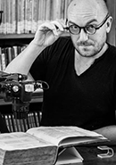
Ewan is a calligrapher and part-time Professor in Design at The University of Sunderland where he co directs the International Calligraphy Research Centre. He grew up associated with a community of craftsmen at Ditchling in Sussex founded by Eric Gill. Ewan has enjoyed a varied professional career working as both a calligraphy teacher and a consultant to Xerox PARC, and he is currently a core faculty member at the Royal Drawing School in London. In 2013 he was awarded the first Karl-Georg Hoefer prize by The Schreibwerkstatt Klingspor for his work in calligraphy and education. His book on the history of calligraphy and typography The Golden Thread is out in paperback this year in the USA and has recently been released in Spanish and Italian translations.
• www.ewanclayton.co.uk
• Ewan's book on Amazon
G. Scott Clemons has collected the Aldine Press since his days as an undergraduate in the Classics Department at Princeton University. He currently serves as the President of the Grolier Club, Treasurer of the Bibliographical Society of America, and is a past Chairman of the Friends of the Princeton University Library. Outside of his bibliophilic interests, Scott is the Chief Investment Strategist of Brown Brothers Harriman & Co., a privately-owned investment firm in New York City. Scott curated the exhibition Aldus Manutius: A Legacy More Lasting Than Bronze, on display at the Grolier Club this past spring, and is the co-author of a companion volume to the exhibition, soon to be available from Oak Knoll Books.
Following his training in typographic design at the London College of Printing, James Clough moved from London to Milan in 1971 and pursued a career in typography, lettering and calligraphy. In 1991 he was a founding member of the Associazione calligrafica Italiana and in 2016 he was convenor of an international conference in Milan on the future of handwriting. For the past thirty years he has deepened his knowledge of the history of writing, type and the graphic arts and he has lectured on these subjects in Italy and various European countries as well as the USA. Besides his many articles and lectures on Bodoni, Clough is the author of Alphabets of Wood, a history of Italian wood type, and Signs of Italy. From 2016 to 2019 the Italian newspaper La Repubblica published his Sunday column on historical and modern Italian inscriptions and signs. In 2021, as a member of the Nebiolo History Project, he gave a talk for the Herb Lubalin Lecture Series on Microgramma and Eurostile and another on Bodoni.
Doug Clouse is a graphic designer and teacher who lives in New York City. He wrote MacKellar, Smiths & Jordan: Typographic Tastemakers of the Late Nineteenth Century, and co-wrote The Handy Book of Artistic Printing with Angela Voulangas.
• The Graphics Office
Andy Clymer is a typeface designer and developer living in New York City and has been an instructor in the Type@Cooper program since 2011. He received a Bachelor of Arts degree in graphic design from San Diego State University and a Master of Design degree in type design from the Type & Media postgraduate course at the Koninklijke Academie van Beeldende Kunsten (Royal Academy of Art) in The Hague, Netherlands. Until May of 2018, Andy had worked for almost thirteen years at the Hoefler&Co. type foundry, where he contributed to the typefaces Vitesse, Forza, Ideal Sans, Archer, Surveyor, and spearheaded the design of Operator and Obsidian.
• Andy Clymer
Stephen “Stüf” Coles (he/him) is Associate Curator & Editorial Director at Letterform Archive. Previously, he served as FontShop’s creative director and a member of FontFont’s TypeBoard. He was also an independent consultant, connecting font makers with font users and advocating for the interests of both groups. Stephen wrote the book The Anatomy of Type and co-founded the websites Typographica and Fonts In Use.
Stephen Cronin is a front-end web developer working at The Outline living in Queens. After moving to NYC seven years ago he has spent his time working at web agencies, start ups, and editorial websites including Code and Theory, HYPERHYPER, and The Intercept. He has worked with many renowned designers in the web industry executing high-fidelity designs. During his free time he enjoys creating hand lettering artwork and practicing calligraphy. He has received calligraphy training through public workshops at Type@Cooper and Society of Scribes.
Andy spent his early years learning the dark arts of hot rodding from his father and skating the mean streets of Elsmere, Delaware. After graduating from Delcastle Vocational and Technical High School with “shop” certification in Commercial Art, he opted to skip art school and get right to work. As the art director and creative nerve center of House Industries, Andy uses his calm, quiet demeanor to cajole frustrated House artists, designers and collaborators into forgeting the rules for a just moment to figure out the best way to create something worthwhile. His work is in the permanent collection of the Smithsonian Institution’s Cooper-Hewitt, National Design Museum, and the Henry Ford Museum of American Innovation. Andy recently completed the book House Industries: The Process is the Inspiration with co-authors/long time conspirators Rich Roat and Ken Barber. If he’s not collecting furniture, Japanese folk art or other junk that will somehow turn into a House Industries design project, he’s spending time with his ladies: wife Stephanie and daughters, Ava and Mia.
Greg D’Onofrio is a designer, writer, educator, and co-founder of Display, Graphic Design Collection. Greg has curated, lectured, and written about topics ranging from Bruno Munari and Lester Beall to Elaine Lustig Cohen and Morton and Millie Goldsholl. Greg teaches Graphic Design History at the School of Visual Arts and Cooper Union in New York City. He is co-author of The Moderns: Midcentury American Graphic Design and Italian Types: Graphic Designers from Italy in America.
• Display
• Kind Company
Tiziana D’Angelo received her Ph.D. in Classical Archaeology from Harvard University in 2013. She is currently a Jane and Morgan Whitney Postdoctoral Fellow in the Department of Greek and Roman Art at the Metropolitan Museum of Art. She holds a B.A. in Classics from the Università degli Studi di Pavia, Italy, and an M.Phil. in Classical Archaeology from the University of Oxford. Her research and curatorial interests include Greek, Roman, and Etruscan art and archaeology. D’Angelo has participated in archaeological excavations in Italy and Turkey, and held research fellowships in Cambridge (St. John's College), Oxford (St. Hugh's College), Rome (Phi Beta Kappa Society), Los Angeles (Getty Research Institute), and Berlin (Deutsches Archäologisches Institut).
• Tiziana D’Angelo
Mike Daines studied typographic design at the London School of Printing in the 1960s and began his career as a type designer in the London studios of Letraset, where he designed a number of typefaces, notably Hawthorn and University Roman. He worked in display photosetting at Alphabet and TypeShop, then, as a director of Letraset’s Typographic Systems Division, he managed URW, Hamburg, involved in the installation of the Ikarus type digitization systems for Monotype, Compugraphic, Berthold and Linotype. Mike later founded Baseline magazine, Applied Graphics Limited, co-founded Applied Arabic, an Arabic type design licensing company, and The Foundry (with David Quay and Freda Sack), an early digital typefoundry. In 2003 he established eLexicons Limited, to develop interactive learning resources, where he edited and published the eLexicon of Typography.
• eLexicons Limited
Cara Di Edwardo is a lettering artist, designer and adjunct professor at Cooper Union and has spent many years in the classroom and in planning educational programs. She is past president of the New York Society of Scribes and has served on the board of the Type Directors Club. She is a founder and the director of the Type@Cooper Program. She holds a BFA from Cooper Union, and has done further studies at ENSAD, Paris, Hunter College, NY and Kyoto Seika University, Japan.
Petra Dočekalová is a typographer and letterer based in Prague, Czech Republic. Since 2013 she is a member of Briefcase Type Foundry team. She received TDC Award of excellence for her diploma project dealing with the Czechoslovak calligraphy and new hand lettering forms. Petra will finish her PhD studies at the Type Design and Typography studio at UMPRUM Academy in Prague this year with her thesis focusing on school cursive and handwritten typefaces, their applications and overlap from the academic to the practice and educational environment. She is also focused on editorial work such as book Typo9010, that won several awards all over the world including TDC Award of excellence and her recent project is the book about Jaroslav Benda 1882–1970, Typographic designs and letterforms.
Eric Doctor is a graphic & type designer and teacher in New York City with over a decade of experience working with and for good people. He is a Senior Designer at The Unemployed Philosophers Guild, where he has been a dues-receiving member in good standing since 2014. He teaches typography at Parsons School of Design and has also taught graphic design, type design, typography, and branding at Miami Ad School New York and The Creative Circus. Eric lives in Brooklyn with his dog Vector and is a proud alum of Rice University, Creative Circus, and Type@Cooper.
Kelly Doe is the Design Director for Brand Identity at The New York Times, where she is currently focusing on video, new digital products and the creation of company-wide brand guidelines. Her work involves close collaboration with creative groups from across the company including editorial, product, corporate, extended brand and marketing. Some of her past projects include developing prototypes for the first Times Reader, the redesign of the International Herald Tribune and leading the 2014 rebrand of Times Video.

Kelly's national and international clients have included the museums of the Smithsonian Institution, the National Archives, news organizations and magazines in Asia, Europe and Latin America, and a wide range of publishers, artists and non-profits. She recently completed a 75th Year anniversary book for the National Gallery of Art and is consulting with the Freer and Sackler Museums of the Smithsonian on video installations. Happily, one of her current projects is a book and film on the visual history of The New York Times. Kelly’s design, art direction and creative collaborations have been recognized by awards in the worlds of advertising, editorial and fine art.
Michael Doret grew up in Brooklyn, New York near the tattered remains of the wonderful old collection of amusement parks known as Coney Island. Inspiration for his work came from those early years near the banners, signage and brilliant colors of his Brooklyn neighborhood, and from frequently visiting Times Square where his father worked for MGM among the bright lights, billboards, and general cacophony of the "Great White Way". Similar inspiration came later from such diverse sources as matchbook covers, enamel signs, packaging, and the numerous and varied artifacts of the mid-century America of his childhood.
After graduating from Cooper Union, and after several years at different staff positions, Michael set up a design studio in New York. He has, for many years, specialized in letterform art, and an integrated approach to the disciplines of lettering, illustration and graphic design. He currently runs a studio out of his home in the Hollywood Hills of Los Angeles.
For many years he concentrated almost exclusively on logo and lettering projects, but recently Michael expanded the base of his work to include font design.
Michael’s original fonts and font families are available through his type foundry Alphabet Soup.
• Alphabet Soup
Maria Doreuli is the founder of an independent studio Contrast Foundry. In 2018, craving for new challenges, she relocated to California. Focusing on type design, Maria believes in the power of emotion and working with passion. She’s open to new opportunities and aims to experiment more to find unexpected forms of expression.
Traditional and experimental, self initiated and commercial, her projects have been honored by many international awards—ADC, Communication Arts, Morisawa, Red Dot and Type Directors Club (New York) among others.
Mr. Downer is a sign painter, a typeface designer, and an educator. He has written about type and type history for various publications and is widely known as a perceptive type critic. His typefaces have been published by Bitstream, Font Bureau, Emigre, House Industries, and Design Lab. Among his most popular type designs are Iowan Old Style (on Apple Books and iOS 7+), Roxy, Ironmonger, and the ubiquitous food and beverage branding favorite, Brothers.
A native of the Pacific Northwest, a region of the US with a rich history of sign painting and hand-lettering, Mr. Downer was first introduced to commercial pen & brush lettering in the 1960s in junior high school. He began an apprenticeship in a sign painting shop at age 18. He holds BA, MA, and MFA degrees in art.
Mr. Downer has been a journeyman sign painter since 1973, a freelance typeface designer since 1983, and a crusader for designers’ rights his entire adult life. He began teaching lettering at the university level in 1972, making him one of the most experienced American educators in the fields of lettering and typeface design. He’s been teaching in the Type@Cooper program at The Cooper Union since its founding in 2010. He established the Sign Painting Support Group on Facebook as a platform to educate and guide serious enthusiasts and professionals in the principles of letter construction and the tricks of the trade. Follow him on Instagram.
After graduating from California College of the Arts, James received a masters from the TypeMedia program at The Royal Academy of Art in The Hague, Netherlands. James lives in San Francisco, and runs OH no Type Company, an independent foundry focussed on display faces and expressive lettering.
• OH no Type Co
Originally from Paris, France, Stéphane Elbaz is a graphic and type designer currently living and working in New York City. He recently joined First Look Media where he serves as Head of Product Design, Magazines. In the last few years he devoted much of his time to digital publishing platforms. In addition, he continued his type and brand design practice.
For Code and Theory he led visual design on various projects including Vanity Fair and GQ for Condé Nast France, the LA Times, Interview, and Art in America. As an independent designer, Stephane recently created a brand typeface for Sephora and participated in brand projects for companies in sectors ranging from culture and fashion to the energy industry. In 2009 he was awarded the Certificate of Excellence in Type Design from the Type Directors Club of New York for his type family Geneo.
• stephaneelbaz.com
Hannes Famira is founding principal of FamiraFonts. He is a graphic designer, a type designer and a teacher of both disciplines. After 20 years in the Netherlands, Germany and Switzerland he now lives in Brooklyn, New York.
His library of retail typefaces is available from Adobe Fonts, Type Network and I Love Typography. You can see work in progress at Dribbble. Companies like Céline, Helmut Lang, GoDaddy, Mansur Gavriel and Theory have commissioned custom tailored logo and corporate typeface solutions. Most recently Hannes drew a typeface for the opening titles of the AMC television show Interview With The Vampire.
Hannes’ understanding of type comes mostly out of his Dutch design education at the Royal Academy in The Hague (KABK). With a painter for a mother and neo-modernist architect for a father his earliest influences are based in a love for Scandinavian and traditional Japanese design. Combining the freedom of painting with the structured thinking of architecture seems to have quite naturally led him to type design at the center of his creative work.
After having worked at Meta Design, at the Buro Petr van Blokland and at House Industries Hannes started his own design studio Das Kombinat in 1999. He added Kombinat-Typefounders in 2001 and renamed it FamiraFonts in 2016.
An ongoing practice of teaching type has been the most formative influence on Hannes’ thinking since his years as a student at KABK. He has been teaching in the Type@Cooper Extended and Condensed programs at the The Cooper Union since January 2011. Hannes also taught various typography and type design classes at the Basel School for Design in Switzerland, at The Cooper Union New York City, SVA the School of Visual Arts, the UArts in Philadelphia, the New Jersey City University, the Hochschule für angewandte Wissenschaft und Kunst Hildesheim/Holzminden/Göttingen, the Kunsthochschule Kassel, Rutgers University and the City University of New York.
• www.famira.com
• www.famirafonts.com
Dikko Faust founded Purgatory Pie Press, one of the longest running artist/presses. Purgatory Pie Press limited editions are in public and private collections worldwide including MoMA, the Metropolitan Museum, the Cooper Hewitt, and London's V&A and Tate Modern. Dikko had taught letterpress and run the letterpress shop at Cooper and now teaches at School of Visual Arts where he was instrumental in setting up their type shop.
Tom Foley is a graphic designer, typographer and type designer currently living and working in London. Tom earned his BA in Visual Communications from Limerick School of Art and Design in 2007 and MA from Central Saint Martins in 2009. Prior to joining Dalton Maag he worked with Polimekanos, Micha Weidmann Studio, Atelier Dreibholz and Atelier David Smith. Tom also occasionally teaches design and has carried out lectures and workshops at Universities including Central Saint Martins, University of West England, Limerick School of Art & Design, Dun Laoghaire Institute, University of Santa Clara, Ravensbourne and SVA New York. From 2011 - 2015 Tom worked as a full time Font developer at Dalton Maag where he has been involved in custom and library Type design projects covering Latin, Greek, Cyrillic, Tamil and Bengali script systems. Tom currently works as Senior Typographic Advisor at Dalton Maag.
Colin Ford is a New York-based typeface designer at Hoefler & Co. He is a graduate of the Type and Media masters program at the Koninklijke Academie van Beeldende Kunsten (KABK) in The Hague, and of the Maryland Institute College of Art (MICA) in Baltimore. Since joining H&Co in 2011, he has worked on a variety of projects, including Decimal, which was featured in the Netflix documentary series, Abstract. He has lectured and taught workshops at the Atelier National de Recherche Typographique, The Letterform Archive, The Cooper Union, and MICA.
Giulio Galli is a typeface designer, researcher and teacher based in Brussels, Belgium. Born and raised in Pesaro, Italy, he got a BA in Graphic Design at ISIA Urbino in 2019 and moved to specialize in Typeface Design at the University of Reading in 2021. He is currently conducting research in typography and legibility at READSEARCH Research Lab and teaching typeface design and typography at PXL-MAD School of Arts in Hasselt, Belgium. Since 2018 he is also associate of CAST Foundry (Cooperativa Anonima Servizi Tipografici), a type foundry set up as a cooperative in Bozen, Italy.
Oleś Gergun is a digital designer and developer based in Kyiv and Leipzig with a background in Cultural Studies. He gained a degree of Master of Arts in Culturology at Kyiv-Mohyla Academy. Subsequently, he became a designer through an autodidact will, not least because of his interest in creative coding. In his practice, he applies both design and code for commercial and non-commercial clients. Being a critical mind and a dedicated practitioner, he applies his analytical and strategic approach to KTF. His type design practice is a continuation of his Kyiv Type Digest blog, an ongoing research of vernacular typography in Kyiv. His typographic debut is a contribution to our shared project KTF Jermilov.
William Germano received his B.A. from Columbia and his Ph.D. in English from Indiana University. He was appointed dean and has taught at Cooper Union since 2006. He teaches the freshman core, as well as courses on Shakespeare, opera, the history of the book and an elective on puppets and robots.
Barbara Glauber founded the New York-based design studio Heavy Meta in 1990. The studio focuses on projects for cultural institutions, collaborating with artists, curators, and editors to create publications, interdisciplinary exhibitions, information graphics, and identities. She has designed over 90 books for clients such as the Whitney Museum, Bard Graduate Center, the Guggenheim Museum, The New School, LACMA, Carnegie Museum of Art, Tang Museum, Morgan Library, Dartmouth College, Philadelphia Museum of Art, and the Brooklyn Museum. Her publications have been selected for the AIGA 50 Books 50 Covers 17 times and won numerous awards including the Alice Award for the most beautiful illustrated book. She has had the privilege of working on monographs for notable subjects such as Someday is Now: The Art of Corita Kent, Hilma af Klint, and Kehinde Wiley. Barbara has an MFA from CalArts, teaches design at Yale and Cooper Union, and is a co-curator of the Typographics Conference.
Olivia Glennon is a designer, software engineer, and project lead for Fathom Information Design in Boston, MA. With Fathom, she has worked on projects for GE, National Geographic, and Mayo Clinic. Currently, she leads Fathom’s efforts in building tools for scientists and response teams studying and working to contain the spread of COVID-19. She graduated from the Cooper Union with a BFA in 2014.
Polina Godz is an art director at the Tribune magazine, and a graphic designer at the Jacobin magazine. She holds a BFA in Graphic Design from the Rhode Island School of Design, and a BA in Modern Culture and Media from Brown University. She was a part of the Type@Cooper Extended program in 2020–21 and is still working on a few projects started then. She is originally from Kharkiv, Ukraine.
is a designer, art director, animator, and musician originally from Boston, MA. Formerly Associate Partner on Emily Oberman’s team at Pentagram New York, now freelance in Portland, OR.
• Todd Goldstein
Romello Goodman is a DC-based Designer who specializes in applying computational techniques to web technologies and printmaking. He is a Design Technologist at Block working on their Brand and Purpose team and an Adjunct Faculty member in the Graphic Design department at MICA.
As a technologist, I examine the computer’s role in the creative process through the practice of printmaking. Through the introduction of computational and generative techniques, I create ways of imbuing individuality and specificity into each graphic.
I — — o Gordon — a man from another planet. He’s not on TickTock, doesn’t watch TV shows, doesn’t listen to music, and considers himself an avatar for a poet. He’s designed hundreds of typefaces but is not a typeface designer. He wrote the “Book of Letters From Аа to Яя” — the first ever book about the anatomy of the Cyrillic alphabet — in order to really understand the alphabet. He invented the best software for making letters (unfinished as of yet). He coined several important typographic terms that are not yet in the English language. For the last 10 years he’s been making literary maps of cities, each more elaborate than the last.
Frank Grießhammer has been working as a type designer and font developer with Adobe since 2011.
Before coming to California, he graduated from the Type and Media masters program at the Royal Academy of The Hague in 2010, worked for FSI FontShop International in Berlin, and studied graphic design at Saarbrücken, Germany, and Florence, Italy.
Allan Haley is Director of Words & Letters at Monotype Imaging. Here he is involved in all aspects of building and maintaining the company’s typeface library. Mr. Haley is also responsible for educational content for the company’s web sites and is an important link between Monotype Imaging and the graphic design and design education communities.
Prior working for Monotype Imaging, Mr. Haley was principal of Resolution, a consulting firm with expertise in fonts, font technology, type and typographic communication. He was also executive vice president of International Typeface Corporation.
Mr. Haley is ex officio Chairman of the Board of the Society of Typographic Aficionados, and past President of the New York Type Directors Club. He is highly regarded as an educator and is a frequently requested speaker at national computer and design conferences. Mr. Haley is also a prolific writer, with six books on type and graphic communication and hundreds of articles for graphic design publications to his credit.
• Monotype
Berton Hasebe is a type designer living in New York. From 2008–2013 he worked at Commercial Type, helping to develop typefaces for retail release, and custom typefaces for clients including Bloomberg Businessweek, The New York Times, Nike, and Wallpaper*. Through Commercial Type he's released the typefaces Druk, Portrait and Platform. Since 2013 he's worked independently and teaches typography at Parsons The New School for Design and type design at the University of the Arts in Philadelphia.
Berton received his bachelors degree in graphic design from Otis College of Art and Design in 2005, and moved to the Netherlands in 2007 to study type design at the Type and Media masters program at The Royal Academy of Art in the Hague (KABK). His typeface Alda, designed while attending Type and Media, was awarded the 2008 judges pick from the Type Directors Club in New York and was released by Emigre in 2011.
Berton's work has been recognized by the ATypI, BRNO Biennale, TDC, and Tokyo TDC. In 2012 he was featured as one of Print Magazine’s New Visual Artists.
• Berton Hasebe
Norman Hathaway is an art director and design historian. He is the author of Overspray and co-author with Dan Nadel of Electrical Banana: Masters of Psychedelic Art and Dorothy and Otis: Designing the American Dream. He has led creative initiatives for institutions including The Design Museum, London and the Royal Academy of Arts, as well as artists including Paul McCartney. He has taught widely on the history of design and typography for the London College of Printing, The Royal College of Art, and Goldsmiths College.
• normanhathaway.com
Cyrus Highsmith is a letter drawer, teacher, author, and graphic artist. He teaches type design at Rhode Island School of Design (RISD). He wrote and illustrated the acclaimed primer Inside Paragraphs: Typographic Fundamentals. In 2015, he received the Gerrit Noordzij Prize for extraordinary contributions to the fields of type design, typography, and type education. In 2017, he became Creative Director for Latin Type Development at Morisawa USA. He goes to bed very early.
• Occupant Press
• The Font Bureau Inc.
Jessica Hische is a letterer, illustrator, graphic designer, and typeface designer living in Brooklyn, NY. You may know Jessica through her various projects, like Don’t Fear the Internet, Daily Drop Cap, Should I Work for Free?, or Mom, this is how twitter works.
Jessica previously worked at Louise Fili Ltd where she was Senior Designer. She has worked for clients such as Tiffany & Co., Victoria’s Secret, American Express, Target, New York Times, Boston Globe, Chronicle Books, Random House, and Penguin Books to name a few. Her work has been featured in most major design and illustration publications including Communication Arts, Print magazine, STEP magazine, HOW magazine, Graphis, American Illustration, and the Society of Illustrators annual. She was featured in 2009 as one of STEP magazine’s 25 emerging artists and as one of Print magazine’s New Visual Artists 2009.
She very much enjoys good food, black coffee, and her two cats, Olive and Billy.
• www.jessicahische.is
Sofie Hodara is a Boston-based multimedia artist, designer, and educator. Her work explores the intersection between traditional and cutting-edge media in order to create beautiful, non-utilitarian experiences with technology. She is a member artist at Bromfield Gallery (Boston MA) and frequent collaborator with colleague and friend, Martha Rettig. She teaches design at Massachusetts College of Art and Design, SMFA at Tufts University and Emmanuel College. She lives in Brookline with her partner, Nate, and lots of art on the walls.
Jonathan Hoefler has been designing typefaces since 1989. His company, Hoefler & Co., is home to one of the world’s most distinguished font libraries, designs such as Knockout, Gotham, Mercury and Archer that are known for both high performance and high style.
Hoefler has been awarded both the Prix Charles Peignot for outstanding contributions to type design, and the AIGA Medal, the design profession’s highest honor. A two-time honoree of the National Design Award, H&Co’s work is in the permanent collections of both the Smithsonian Institution and the Museum of Modern Art in New York.
• Hoefler&Co.
Elinor A. Holland, a student of both Arabic and English calligraphy for over twenty years, has taught calligraphy to students of all ages at schools, museums, and other learning institutions since 1994, including the New York Public Library, The Smithsonian Institute, the Center for Book Arts, and the Metropolitan Museum. Her freelance work includes private and commercial commissions.
• Harmony of Line
Eric Holzenberg is Director of the Grolier Club of New York, America's oldest and largest society for enthusiasts in the book and graphic arts. Since 1994 he has shaped the Grolier Club's mission to celebrate the enduring value of the book-as-object, promoting the Club's 100,000-volume research library on books and printing, its 128-year-old series of public exhibitions on bookish themes, and its venerable roster of finely printed books-on-books. A former chair of the Rare Books & Manuscripts Section of ALA/ACRL, and past president of the American Printing History Association, Mr. Holzenberg holds an MA in library science from the University of Chicago, where he specialized in rare books and manuscripts; and an MA in history from Loyola University of Chicago. Among other books for the Grolier Club, he is the author of The Middle Hill Press (1997), and co-author of For Jean Grolier & His Friends: 125 Years of Grolier Club Exhibitions & Publications, 1884-2009. He has in addition written numerous articles, and lectured widely, on various topics in bibliography, bibliophily, and book history. His course on "The Printed Book in the West Since 1800" has been taught annually at the University of Virginia's Rare Book School program since 1998, and he is also an adjunct faculty member of the Rare Books Program of the Palmer Library School of LIU. Mr. Holzenberg is an avid collector of (among many other things) books on architecture and design, particularly the English Gothic Revival, and the Aesthetic Movement in Europe and America.
• The Grolier Club
Nol Honig is a director, designer, and animator in New York City. In his spare time, he can often be found wearing neckties.
Over the years he has worked with an impressive array of clients, including Coca-Cola, CBS, MTV, YouTube and the Philadelphia Museum of Art. In 2012 he was one of the lead motion designers for Barack Obama's presidential campaign.
Aside from his client work, Nol is also a passionate educator. In 2017 he received a Distinguished Teaching Award for his work teaching motion graphics at Parsons School of Design. He also is the creator of the popular online class After Effects Kickstart at School of Motion.
In addition to work with The Drawing Room, Nol is a regular contributor to the industry blog Motionographer where he has profiled some of the most innovative and interesting people working in motion graphics today. In 2017 he was an advisory board member and short-list judge for the Motion Awards, the first award show exclusively for the field of motion design.
Jase Hueser is a graphic and motion designer specializing in identity design and animated media. He currently works at Pentagram with partner, Emily Oberman, designing and leading the motion-related aspects of identity development with clients such as Saturday Night Live, Warner Bros., Netflix, NBC, PBS, Amazon Prime Video, Film Independent and many more. His work has been recognized by AIGA, AAF, and TDC. Originally from Omaha, Nebraska, he holds a BFA in Visual Communication Design from the University of Nebraska at Kearney and now lives in Brooklyn, NY.
A graphic designer with an edge of motion, making work in broadcast, nightlife, media, and event production. She’s a founding member of Little Cinema, an immersive theatre company based out of House of Yes, Brooklyn, and maintains an active practice of collaboration with studios, nonprofits, and creative individuals of all kinds. She partnered with AIGA Eye on Design Magazine to design the Psych issue, winning Stack Magazine’s Cover of the Year for 2018. She has made work for Pentagram, Medium, The New York TImes, New Yorker Magazine, GIPHY, Squarespace, The FADER, and MTV News; attempting to make cable television relevant again via interstitials, GIFs, broadcast takeovers, and general randomness. Shira holds a BFA from Bezalel Academy of Arts and Design, Jerusalem, and an MFA from Yale University, and currently teaches motion graphics at Parsons School of Design in New York City.
Mark Jamra is a type designer and professor at Maine College of Art, who has designed and produced typefaces for over 35 years. He is the founder of TypeCulture, a digital type foundry and academic resource, and is a founding partner of JamraPatel, a studio focusing on type design for under-supported language communities. Mark has taught graphic design, lettering, typography and type design at colleges and workshops in the U.S. and Germany. His typefaces have received recognition from the TDC and the Association Typographique Internationale. Follow Mark on Instagram and Twitter
• TypeCulture
• JamraPatel
Chester was born in Montéal, and attended Dawson College there. After graduation he spent two years at Newell & Sorrell in London and Utrecht, working on identity projects and saw the publication of his first typeface by Font Shop International. In 1995 Chester moved to Chicago to work with Rick Valicenti and eventually become a partner in his digital type foundry, Thirstype.
In 2004 he decamped to New York City and formed Village with his wife and partner Tracy Jenkins.
Chester's published designs have been used for branding programs -- including AT&T, Starwood Hotels, CBS Television, Nike -- as well as cultural and educational clients -- San Francisco Ballet, Columbia University Business School, the National September 11 Memorial & Museum, etc. He has created bespoke typefaces for Blackberry, Cooper Hewitt Smithsonian Design Museum, and the National Football League, amongst many others.
• Village
In 1968 Alan began his career as an Art Director in New York City advertising agency. By 1974 he decided that the commercial art world was not for him and moved his family to the country and started his own business which still thrives after over 35 years. His east coast studio is a restored barn and gristmill built in 1825 located in northwest New Jersey. Alan works in his studio in Loveland, Colorado sketching, and painting in bold color impressions of the enchanting southwestern landscapes. His experimental painting techniques and unusual color sense are utilized in his fine art painting of a spiritual nature.
Alan has been so successful as an independent custom auto artist and pinstriper, he is continually being sought after for his vast experience and knowledge of antique, classic and custom automotive pinstriping details. He is able to remain independent, creating award winning masterpieces that adorn vintage auto and boat restoration projects, which appear in museums and private collections all over the country. He is a consultant for automotive paint manufacturers He has created his own line of signature brushes with The Mack Brush Company.
Alan wrote the How To Pinstripe book for Motor Books, along with several "How -To" articles for trade periodicals. He has taught his unique American art form throughout the U.S.A.,Finland, England and Scotland. In 2009 he received the Pinstripe Legend lifetime achievement award for his unique artwork in the Kustom Kulture world. Each year he organizes or participates in charity art auction events, raising money for kids. Some of the charities he enjoys working with are The Wisconsin Children’s Hospital,The Two Kids Foundation , Make-A-Wish Foundation, Ronald McDonald House and the Special Olympics.
A multi-disciplinary designer with diverse experiences in the sectors of motion design, branding and environmental design. Jonathan is currently a senior designer in the Pentagram New York office. Prior to Pentagram, Jonathan worked and collaborated with studios like 2x4, Other Means and Gretel working to projects for international clients like Apple, Google, Nike and more. He graduated from The Cooper Union, during his final year he worked on the Lubalin 100 project creating animations from Herb Lubalin’s original storyboards.
Scott is a founder of Typetura, a company focused on digital typesetting. Having launched large scale websites like Vox, Chorus, SB Nation, and Racked while also having worked on fonts like Omnes at Darden Studio. Scott has decades of experience bringing outstanding typography to digital products. Unsatisfied with existing typesetting approaches, at Typetura Scott blends his love of digital products and type together, developing innovative typesetting solutions.
• scottkellum.com
Jerry Kelly is a calligrapher, book designer, and type designer working in New York. His work in these fields has won numerous awards, including from the Type Director’s Club, Society of Typographic Designers, and more than thirty selections in the prestigious AIGA “Fifty Books of the Year” award. In 2015 he was presented with the 28th Goudy Award from RIT.He has also written numerous articles and several books on calligraphy and typography, including Artist and Alphabet (The American Institute of Graphic Arts & David R. Godine, 2000), A Century for the Century (The Grolier Club, 2000), and The Art of the Book in the Twentieth Century (Rochester Institute of Technology, 2011). Before starting his own business in 1998, Kelly was Vice President of The Stinehour Press, Vermont; preceded by a decade as designer at The Press of A. Colish, New York. Since 1977 he has actively maintained a small fine printing operation, The Kelly-Winterton Press. In addition, he has taught at The Pratt Institute, Parsons School of Design, Society of Scribes, etc., and lectured widely. Kelly served as Chairman of the Board of the American Printing History Association, President of The Typophiles, and as an active member of several committees at The Grolier Club, New York. He is an Honorary Member of the Double Crown Club (London), and a corresponding member of the Bund Deutsche Buchkunstler (Munich).
• Nonpareil Typefoundry
Book designer, photographer, and teacher Bruce Kennett lives in rural New England. After earning a B.A. in humanities and working as an architect and printer, he moved to Austria to study calligraphy and book design with Friedrich Neugebauer, and later translated Neugebauer’s The Mystic Art of Written Forms. During the 1980s, he was the managing director of Maine’s renowned Anthoensen Press, and since then has maintained his own studio with clients that have ranged from the Folger Shakespeare Library, Boston College Law School, and the Grolier Club to L.L. Bean and the Mount Washington Observatory. In the peaceful surroundings of his country studio, Bruce designs illustrated books and exhibition graphics, and makes large-scale murals of his photographs.
Bruce has collected the work of W. A. Dwiggins since 1972, and has been writing and lecturing about him since 1980. His comprehensive biography, W. A. Dwiggins: A Life in Design (Letterform Archive, 2017), captures the inspiring accomplishments and wit of this amazing artist.
Ben Kiel is a typeface designer, an educator, and a partner in XYZ Type. Ben worked for several years at House Industries, with a specialty in solving complex problems at the overlap of design and technology. He received his MA in Typeface Design from the University of Reading. He currently teaches at Washington University in Saint Louis and Type@Cooper.
• Ben Kiel
Indra Kupferschmid is a German typographer and professor at HBKsaar, University of Arts Saarbrücken. Fueled by specimen books, she is occupied with type around the clock and in all its incarnations: webfonts, bitmap fonts, other fonts, type history, DIN committees, research, writing, designing, and any combination of this. She is co-author of Helvetica forever by Lars Müller Publishers and wrote Buchstaben kommen selten allein, a typography text book (German; Niggli). She consults for the type industry, contributes to print- and web projects such as Codex, Slanted, Typographica and Fonts In Use, next to juggling her own small- and ultralarge-scale ventures.
• kupferschrift
Troy Leinster is an Australian-born typeface designer. He holds a Master's Degree in Typeface Design from Type & Media program at The Royal Academy of Art (KABK) in The Hague, the Netherlands, and is a graduate of the first Type@Cooper Condensed Program in New York. Through 2014-2021, Troy was a full-time typeface designer at the Hoefler&Co Type Foundry. His projects included retail typefaces such as the Ringside superfamily, Operator Mono, Peristyle, Isotope, Cesium, Parliament, and Decimal. In 2022 Troy launched his own type foundry, Leinster Type, debuting Brisbane, a contemporary humanists sans serif for use in wayfinding and text settings.
Valerie Lester is the author of Giambattista Bodoni: His Life and His World, the biography of Giambattista Bodoni (Godine, Spring 2014). She is also the author of Phiz, the Man Who Drew Dickens (Chatto & Windus, 2004), a biography of her great-great- grandfather, Hablot Knight Browne, Dickens's principal illustrator; and Fasten Your Seat Belts! History and Heroism in the Pan Am Cabin (Paladwr Press, 1995), which is a history of Pan American World Airways told from the point of view of its cabin crew. Her translation of Le Grand Meaulnes (The Magnificent Meaulnes) was published by Vintage Press in 2009.
• valerielester.com
• Valerie's book on Amazon.com
Kyle Letendre is a lettering artist, illustrator and type designer based in Portland, Oregon. Born and raised in White Bear Lake, Minnesota, they obtained a BFA in Graphic Design from Columbia College Chicago in 2011, and completed the Type@Cooper Condensed Program in 2021. Informed by their background in screen-printing and drawing, Kyle’s work explores forms as vessels for expression, blurring the binaries between type and image.
Since 2016, Kyle has operated an independent, one-person studio focusing on commercial lettering, illustration and graphic design. Their fusion of flair and function have attracted clients such Target, Penguin Random House, Mercedes-Benz, Lee Jeans, New Belgium Beer, Instagram, and YouTube.
Jean-Baptiste Levée works methodically in a process where history and technology are approached altogether within the nuances of artistry. He manufactures functional, yet versatile digital platforms for designers to build upon.
Levée has designed over a hundred typefaces for industry, moving pictures, fashion and publishing. His work has won multiple awards and has been shown internationally in group and solo shows. It is featured in the permanent collections of the French national library (BnF) and the National Center of arts (Cnap); of the Newberry Library in Chicago, and several printing museums in Europe. He is a board member and the country delegate for France at ATypI (Association Typographique Internationale). Levée curates exhibitions on typeface design, organizes research symposiums and teaches typeface design at the Amiens school of Arts & Design and at the University of Corte. He is a typography columnist and editor on Pointypo.com.
Patrick Li is the founder and creative director of Li, Inc., a multi-disciplinary design studio founded in 2000. Mr. Li is also the creative director of T: The New York Times Style Magazine, a post he’s held since 2012.
Li, Inc. has developed brand and image strategies for some of the leading references within the fashion, beauty and art industries. Clients and projects include advertising design for Givenchy, Clinique, and H&M to brand identity projects for the Hirshhorn Museum, MOCA Los Angeles, Garage, Frédéric Malle and Jason Wu.
Li, Inc. has designed numerous monographs and artists' books, including "Louis Vuitton: Art, Fashion, Architecture" published by Rizzoli; "Rodarte Catherine Opie Alec Soth" published by JRP; “Kaws" published by Rizzoli and the Aldrich Museum of Art; and “Francesco Vezzoli” published by Rizzoli.
Mr. Li was also the Art Director at Large for Vogue China from the magazine's inception through 2013. He studied architecture at the University of California at Berkeley.
Ruth Lingen studied typography and bookmaking with Walter Hamady, and was also his shop assistant for 3 years. Under his influence, she discovered the pleasure of collaborating with writers and artists. Since then, she has collaborated with over 60 artists in book and print form, and her books are held in over 40 public libraries. A member of the Booklyn Artist Alliance, Ruth has twice received the "50 Best Books/Covers Award" from the American Institute of Graphic Arts.
Richard Lipton has been making exquisite letterforms for over 40 years. He was introduced to the magic of calligraphy while studying art and design at Harpur College in upstate New York. He continued his lettering journey in 1975 as a freelance calligrapher, sign painter and graphic designer and established a calligraphy studio in Cambridge, Massachusetts. In 1983, Lipton began working for Bitstream, an innovative digital type foundry under the guidance of Mike Parker and Matthew Carter, eventually helping to make Bitstream’s type library one of the most respected in the industry. In his tenure as senior designer, Lipton developed two original type families: Arrus, and Cataneo (with Jacqueline Sakwa). In 1991, Lipton created an independent type and calligraphy studio and designed many original typefaces including Bickham Script Pro for Adobe and Sloop for Font Bureau. He is currently a senior designer at Font Bureau where he develops original typefaces and custom fonts for international clients. He is currently on the faculty at RISD where he teaches type design and calligraphy.
• The Font Bureau Inc.
Mathieu Lommen is a design historian. He works as a curator of graphic design & typography at the Allard Pierson museum of the University of Amsterdam. In addition to the famous Typographical Library of Typefoundry Amsterdam, this institute holds an extensive collection of Dutch designer archives. Among them are those of Jan van Krimpen, Jurriaan Schrofer and Gerard Unger. The large collection of type specimens is known internationally. Mathieu writes and lectures on the history of book design, type and lettering. His publications include ‘Bram de Does: typographer & type designer’ (2003, with John A. Lane), ‘The book of books: 500 years of graphic innovation’ (2012), ‘Nederlandse belettering’ / ‘Dutch lettering’ (2015 & 2018) and the just published ‘Helmut Salden Uncovered 1:1’ (with Karen Polder). Forthcoming is a monograph on Dutch lettering model books and portfolios. Until 29 August 2021, the exhibition 'Letters of Art Nouveau', which he curated, will be on show in Amsterdam.
Follow him on Instagram
@mathieulommen
@dutch_lettering_history
Ellen Lupton is a writer, curator, educator, and designer. She is Senior Curator of Contemporary Design at Cooper Hewitt, Smithsonian Design Museum in New York City. Recent exhibitions include Beauty—Cooper Hewitt Design Triennial (with Andreas Lipps), How Posters Work, Beautiful Users and The Senses:Design Beyond Vision. Lupton also serves as director of the Graphic Design MFA Program at MICA (Maryland Institute College of Art) in Baltimore, where she has authored numerous books on design processes, including Thinking with Type, Graphic Design Thinking, Graphic Design: The New Basics, and Type on Screen. Her book, Design Is Storytelling, was published by Cooper Hewitt in 2017. Lupton earned her BFA from The Cooper Union in 1985.
• elupton.com
Bruno Maag is a trained typesetter from Zurich, Switzerland. After graduating from Basel School of Design with degrees in Typography and Visual Communications he emigrated to England where he worked for Monotype creating custom typefaces. After a year in Chicago with Monotype he returned to England to start Dalton Maag, focussing on the creation of custom typefaces.
Bruno today is the Chairman of Dalton Maag and in recent years has spearheaded projects for large global companies and small enterprises alike. Some of the clients include Nokia, Intel, HP, Amazon, Lush, Faena, The Stroke Foundation and Rio2016 to name a few. His interests today extend into scientific research into reading physiology and psychology.
After graduating Cooper Union in 2005, Andrew has worked in various fields in broadcast design, animation, and vfx. After three years of being lead compositor at Hornet Inc, Andrew went freelance and has transitioned into pipeline design and workflow optimizations.
Since childhood, Kamal has been captivated with languages. An early encounter with calligraphy led later on to a fascination with the typography of various writing systems. When Postscript fonts appeared on the scene, Kamal took his first plunge into digital typography by leaning on his training in linguistics, design, and computer science to create fonts for less-supported European languages. Soon after, he joined Monotype as Linguistic Typographer and as its representative to the Unicode Consortium. Twenty-five years later, Kamal had worked through the typographic details of more global scripts than he had ever imagined possible. Throughout it all, he has always enjoyed sharing his discoveries by teaching and speaking at conferences.
Russell Maret is a letter designer and letterpress printer working in New York City. He began printing in San Francisco as a teenager before apprenticing with Peter Koch in Berkeley and Firefly Press in Somerville, Massachusetts. He set up his own press at the Center for Book Arts, New York in 1993 and has been printing and publishing ever since. In 1996 Russell began teaching himself to design letterforms, leading to a twelve year study of letterforms before he completed his first typeface in 2008. In 2009 Russell was awarded the Rome Prize in Design from the American Academy in Rome. In 2011, he began working to convert some of his type designs into new metal typefaces for letterpress. Since then he has produced four metal typefaces and four suites of metal ornaments. He is a Master Lecturer in the MFA Book Arts & Printmaking Department of University of the Arts in Philadelphia and the current North American Chair of the Fine Press Book Association. He has been the printer in residence of the Press in Tuscany Alley, San Francisco (1990); Artist in Residence at the Center for Book Arts, NYC (1996); and a trustee of the American Printing History Association. Russell’s books and manuscripts are in public and private collections throughout the world.
Miriam Martincic is an award-winning illustrator whose work has been recognized by the Society of Illustrators New York, Communication Arts, Society of Illustrators Los Angeles, 3x3, and others. Clients include Harper’s, Scientific American, The Wall Street Journal, and The New York Times. Miriam is a freelance illustrator and Teaching Professor of graphic design at Iowa State University. All her art is made under careful dachshund supervision. Follow Miriam on Instagram.
Maurice Meilleur is a recovering political theorist turned graphic designer and design researcher and writer. He completed a PhD in political theory from Indiana University Bloomington in 2004, and earned his MFA in graphic design from the University of Illinois at Urbana-Champaign in 2015. He’s an assistant professor of graphic design at Iowa State University in Ames, Iowa, where he teaches and studies typography and generative design. He has contributed numerous type and book reviews to Typographica and Fonts in Use. He’s writing a book on Jurriaan Schrofer’s constructed scripts, and he’s presented his research at Robothon, ATypI, TypeCon, the Cooper Union, and the Letterform Archive. His experimental modular typeface, Kast, was a jury finalist in the Society of Typographic Aficionados’s 2016 protoType competition. Maurice explores digital drawing and animation using Python and Drawbot as part of a larger investigation into typographic representation and algorithmically-defined formal systems.
Laura Meseguer is a freelance designer, educator, typographer and type designer based in Barcelona, Spain. Her activity is developed in the field of commercial work and personal projects. She specializes in any kind of project based on typography, from lettering for monograms and logotypes to custom typefaces and book design. She is a co-founder of the Type-Ø-Tones, her own type foundry, from which she publishes and promotes all her typefaces. She is the co-author of “How to Create Typefaces. From sketch to screen” published by Tipo e. She is a member of the ATypI Board since 2017.
In 2020 she had her first solo exhibition “The Beautiful People”, curated by Eider Corral, organized by Blanc! and La Sala at Vilanova i la Geltrú (Barcelona). This exhibition presented a kind of prospective monograph, a showcase that is more of a look forward than a backward glance and highlights the relational nature of her professional practice, between people and disciplines and connected to contemporary cultural practices as well.
Wael Morcos is a graphic designer and type designer from Beirut, Lebanon. Upon receiving his BA in Graphic Design from Notre Dame University (Lebanon), he spent three years developing identities and Arabic-Latin bilingual typefaces, in addition to working in print and exhibition design. Wael received his MFA from RISD in 2013, after which he moved to New York and worked with several studios in the city before founding his Brooklyn based practice Morcos Key. Wael has been featured in Print Magazine’s 15 under 30 and was named a Young Gun by the Art Directors Club.
Sébastien Morlighem is a teacher & researcher at the École supérieure d’art et de design d’Amiens (FR). A founder of the Bibliothèque typographique for Ypsilon Éditeur, he has coauthored several books & written many articles. He has also curated several conferences & exhibitions on graphic design, typography, & type design. He holds a PhD from the University of Reading (UK).
• Ypsilon Editeur
For the last twelve years, Daniel Morris has run The Arm, a public access letterpress studio in Williamsburg, Brooklyn. He comes from a family of letterpress printers going back four generations. He has been involved with letterpress at Cooper Union since 2007. www.thearmnyc.com
• The Arm NYC
• The Dale Guild Type Foundry
Victor Moscoso is one of the premier artists of the psychedelic era. Raised in Brooklyn, he attended both Cooper Union and Yale (where he studied with Joseph Albers) before moving to San Francisco in the late 1950s. There he became a primary architect of the burgeoning underground hothouse that would produce brilliant posters, comic books, and album covers. Moscoso’s facility with color relationships and his remarkable ability to seamlessly blend images and lettering into a single entity was used to create a series of groundbreaking concert posters that propelled him to international fame. His posters feature dizzying hand lettering that push the very limits of negative space, and fierce battles between foreground and background. Along with Robert Crumb he was a founding member of the groundbreaking underground comic Zap Comix. Moscoso also designed numerous album covers for Jerry Garcia, Herbie Hancock and others.
• victormoscoso.com
Gary Munch has been captured by type and letterforms for years. Hand-setting in college, internalizing the ducti for Latin scripts, picking and clicking in Fontographer, then FontLab, he still sees type as a device for communication first. For some time he has been teaching in the wilds of Connecticut's Fairfield County, coaxing others to see how type and text works and looks best. He was on the board of the TDC 2000-2008, and made Candara in collaboration with the Clear Type team at Microsoft, and Ergo & Really for Linotype (now Monotype). His website is madly out of date.
Tim has been working on the web since 1997, and specializes in developing custom publishing systems with responsive HTML5 interfaces. His eye for design and affinity for clean code allow him to painlessly integrate his templates into larger systems without sacrificing user experience or aesthetics.Tim started in the non-profit world, moved on to start-ups, shifted to an agency, upgraded to publishing, and is currently the co-founder of the small NYC shop Monkey Do. Tim can be found on Twitter at @murtaugh.
• Monkey Do
Marek Nedelka (*1992) is a Czech designer based in Brooklyn, New York. He specializes in branding, book, and type design, while also pursuing his passion for language, writing systems, and typography under the alias Letter Books.
Raymond 'Stan' Nelson is a practicing punchcutter, typefounder, and letterpress printer who had the great good fortune to work in the Graphic Arts Collection at the Smithsonian's National Museum of American History from 1972 to 2003, and continues to serve there as a Museum Specialist Emeritus. Stan's extensive knowledge of printing and typefounding history, as well as over forty years of practical experience with the oldest technologies for making printing types, gives him a unique perspective when examining the tools and methods connected with the production of metal letter. Stan can be seen making type in videos available on YouTube, as well as in the BBC production The Machine that Made Us, hosted by Stephen Fry.
Charles Nix is a Creative Type Director at Monotype. He taught typography and design for two decades at the Parsons School of Design where he also served as Chair of Communication Design. He is Chairman emeritus of the Type Directors Club.
Stephen Nixon is a type designer & developer based in NYC, working as Arrow Type. He is currently creating fonts for modern typography, upgrading Google Fonts projects into variable fonts, and helping other foundries with type production & mastering. He is a graduate of the TypeMedia masters program at the Royal Academy (KABK) in The Hague, class of 2018. Before that, he worked as a brand experience & software product designer at IBM and studied Graphic Design at the University of Minnesota, Twin Cities. He has previously given talks at TypeCon Education Forum & Typographics TypeLab, and he volunteers with Code Nation to introduce NYC high school students to web development (sneaking in small doses of design & typography education whenever possible).
I’m a designer and researcher, visiting research fellow at the University of Reading where in 2019 I completed my PhD 'A new method of analysing printed type: the case of 15th-century Venetian romans'. In the early 2010s I lectured in Typography at the University of Bolzano, and from the late 1990s I freelanced as a type and graphic designer in Milan and elsewhere in northern Italy. I publish articles and lecture across Europe and I’m a board member of the Nebiolo History Project. I'm a member and co-founder of CAST, Cooperativa Anonima Servizi Tipografici.
Marie Otsuka is a Brooklyn-based designer / developer working on fonts, websites, and tools. She draws typefaces at Occupant Fonts, while independently collaborating with organizations and artists on various typographic projects. Her type design education began as a graduate student at Rhode Island School of Design, where she now also teaches type / programming-related courses.
Elizabeth Otto is an art historian and the author of Haunted Bauhaus: Occult Spirituality, Gender Fluidity, Queer Identities, and Radical Politics and Tempo, Tempo! The Bauhaus Photomontages of Marianne Brandt, and the coauthor of Bauhaus Women: A Global Perspective. She has co-edited five books including Bauhaus Bodies: Gender, Sexuality, and Body Culture in Modernism's Legendary Art School. Otto is a professor at the University at Buffalo (SUNY).
Amy Papaelias is an Associate Professor of Graphic Design at SUNY New Paltz. She has written for type and design-related publications such as Adobe Create and Typographica, and speaks about her research and teaching at ATypI, College Art Association, and the American Printing History Association. Since 2015, she helps keep the lights on at Alphabettes.org, a network supporting and promoting the work of women and non-binary people in type, typography, and the lettering arts.
Neil Patel is a type designer and former semiconductor process engineer based in Portland, Maine. He is the founder of Tetradtype, an independent type foundry, and partner of JamraPatel, a studio focusing on multi-script type systems. Neil’s collaborative logotype designs with local studios has been featured in HOW Magazine and Communication Arts. He also has been known to dabble with programming, which he occasionally ties back into his design practice. Follow Neil on Instagram and Twitter
• Kigelia
I studied applied math at Harvard (BA '75) and vision at Cambridge (Physiology PhD '81), with Campbell and Robson. At Minneapolis ('80 postdoc with Legge), Syracuse ('81-'95 professor), and NASA Ames ('87 sabbatical with Watson and Ahumada), I worked on visual requirements of reading and mobility, on visual testing (e.g. the Pelli-Robson Contrast Sensitivity Chart), and on characterizing the limits of visual perception. Since 1995 I've been Professor of Psychology and Neural Science at New York University, studying letter and object recognition and beauty.
• Denis Pelli at NYU
Luciano Perondi is a typeface designer from the Italian digital type foundry CAST (Cooperativa Anonima Servizi Tipografici). Perondi is also a researcher, associate professor at the IUAV Venice. He is a member of AIS/Design, Associazione Italiana Storici del Design. Deeply involved with design for special education needs, in recent years he took part in a multidisciplinary team carrying out research into typography and dyslexia.
In 1991, Pichotta began working for Font Bureau as an apprentice to David Berlow, honing her skills on projects for Rolling Stone, Esquire, Condé Nast Traveller, the New York Times, Apple, and other major brands. She has managed the production of retail releases for independent designers since 1993, and has contributed several of her own typefaces to Font Bureau’s library. Over the years, she has divided her time between various retail, custom, and OEM projects. In conjunction with its mid-2016 launch, Pichotta took on the role of Type Network’s vice president and principal product manager, overseeing type development and quality for the company’s global alliance of foundry partners.
• The Font Bureau, Inc.
Jean François Porchez is founder of Typofonderie, type director of ZeCraft, Jean François Porchez’s expertise covers both the design of bespoke typefaces, logotypes and typographic consultancy. He is honorary President of the Association Typographique Internationale (was ATypI President in 2004–2007) and frequent speaker at conferences all over the world. Introduced to French Who’s Who in 2009.
After training as a graphic designer, during which he focused on type design, Jean François Porchez (1964) worked as a type director at Dragon Rouge, then at Le Monde newspaper. Since 2012, he teaches at Type@Cooper, (United States) and he is the programme director for typographic & type design at ECV (France). He taught type design at the MA typeface design at the Reading University (United Kingdom), at Ensad, (France) and conduct regularly type design workshops all over the world. He also contributes regularly to international publications. He was awarded the Prix Charles Peignot in 1998 and numerous prizes for his typefaces.
• Typofonderie
• Porchez
Jesse Ragan runs the small type foundry XYZ Type with business partner Ben Kiel, and designs custom typefaces and lettering independently in Brooklyn, New York. He has served on the board of directors for AIGA/NY and has taught at Type@Cooper (which he co-founded) and Pratt Institute. After graduating from Rhode Island School of Design, Jesse started his career at Hoefler & Frere-Jones. Notable past design collaborations include Gotham, Archer, and Omnes.
• jesseragan.com
Dr Rathna Ramanathan is a typographer, researcher and educator known for her expertise in intercultural communication, and alternative publishing practices. She is Dean of Academic Strategy and Reader in Intercultural Communication at Central Saint Martins, London. She has a PhD in Typography and Graphic Communication from the University of Reading, runs her own studio Minus9, and is an ATypI Board Member. Originally from Chennai, India, Rathna is now based in London. Her research and practice are predominantly focused on the Global South, specifically South Asia. For the past twenty years, Rathna has headed research-led, intercultural, multi-platform graphic communication design projects, all fuelled by a love for, and life-long interest in typography and language, and a belief that communication is a fundamental human right.
Gen Ramírez is a typeface designer, graphic designer, calligrapher and sign-painter from Guadalajara, Mexico. His strong interest and passion for brushes and letterforms developed since a young age as he was taught mastery of sign-painting in his father’s workshop. It later led him to graduate from TypeMedia at the Royal Academy of Art in The Hague as well as completing both Type@Cooper Extended program in San Francisco and Condensed in New York. He teaches calligraphy, sign-painting, and type design workshops and leads Letrastica Festival, a conference in Guadalajara. With strong roots in an organic approach to letterforms, his work focuses on embracing both the analog and digital dimensions of design. He loves adding a dash of code in there to spice things up too! His work has been recognized by Latin American Typography Biennial in 2016 and 2018.
Tânia Raposo is a Portuguese designer specialised in typography. She is currently based in the Netherlands, working as a freelance graphic/type designer, researcher and archivist. She is a graduate of the KABKʼs TypeMedia Master, and has previously worked as a graphic designer for the studios Itemzero in Lisbon and Atlas in Palma de Mallorca, as a curatorial assistant at the Letterform Archive and for Cooper Union as the Program Coordinator and teacher for Type@Cooper West in San Francisco.
Rappo Francois lives and works in Lausanne, Switzerland. Born in 1955, trained as a graphic designer, specialized in the field of type design and has published fonts as Didot Elder, Theinhardt Grotesk, Genath, Orso, Plain Grotesque (Optimo font foundry). His type design portfolio includes projects for: Vogue Hommes International, The New York Times Magazine, ICA Institute of Contemporary Art London. From 2001 to 2008 François Rappo was head of jury of ‘The Most beautiful Swiss Books’ competition. He is currently head of master program Art Direction/Type Design at ECAL University Of Art And Design Lausanne.
• Optimo
Matthew is CEO of Business Letters, a coaching and consulting firm for the creative industries. Before its founding in 2019, Matthew led the Fonts, Type, and Typekit teams for Adobe. He joined Typekit prior to its acquisition by Adobe in 2011.
His career on the internet began in the 1980s. At seventeen, he founded one of the first companies solely focused on designing and building dial-up bulletin board systems software for commercial applications. He spent the next 20 years leading the technical teams at several large digital agencies and client service firms.
As CTO of digital agency Schematic (now part of WPP) Matthew spent nearly a decade leading the teams that built hundreds of the largest web sites for the world's biggest companies. Among many others, he led the development of the first streaming video players for the primetime TV networks for both ABC and NBC, as well as the first Beijing Winter Olympic Games — the first to stream every event.
Matthew lives in Montclair New Jersey with his wife Jennifer and two boys, William and James. He owns a sizable collection of ampersands drawn by famous type designers which travel with him (the ampersands, not the designers) everywhere he goes.
Martha Rettig is a designer, experimenter, and immersive artist whose work focuses on merging traditional mediums with emerging technologies. Her experience over the past fifteen years crosses many disciplines, including design concept, visual design, interactive design, interface design, data visualization, experience design, and creative direction. She co-founded an interactive design agency, Cykod, in 2006 and helped build over two hundred websites, and apps from the ground up. Martha currently is an Assistant Professor at Massachusetts College of Art + Design teaching in the undergraduate Graphic Design department and the coordinator of the Dynamic Media Institute MFA program.
Dan Reynolds is an American designer working in Germany. He teaches typography at the Hochschule Niederrhein University of Applied Sciences in Krefeld and researches the history of Germany’s typefoundries between 1871 and 1914. Dan studied graphic design in the US and Germany before attending the MA Typeface Design course at the University of Reading. Writing rather dull copy about fonts, he spent 15 years working for FontFont, Indian Type Foundry, Linotype, LucasFonts, Monotype and MyFonts. This year, Dan started editing Fontstand News. In 2018, he received a research grant from the Printing Historical Society (UK). In 2020, Dan helped catalog hundreds of pre-1950 type specimens at the Technikmuseum in Berlin. His research has been published by Cooperativa Anonima Servizi Tipografici, Klim Type Foundry, the Max Planck Institute, Poem and the Steidl Verlag.
• Typeoff
Dan Rhatigan works with Adobe Typekit in New York as the Senior Manager of Adobe Type. He has over 25 years of eclectic experience in various industries as a typesetter, graphic designer, typeface designer, and teacher, including several years in London and New York serving as Type Director for Monotype. He has a BFA in graphic design from Boston University, and MA in typeface design from the University of Reading in the UK, and a very tattered passport.
• Ultrasparky
Douglas Riccardi is the owner and Creative Director of Memo Productions, a Manhattan-based agency specializing in branding for culinary entrepreneurs working on food halls, brands poised for growth, and restaurant startups. Memo’s work spans the gamut from high-end single-unit restaurants to multiple-unit fast casual concepts. Memo helps clients express their mission, fuel connections with their customers, and create sustainability. His favorite foods are: Chiles rellenos, a classic fried shrimp basket, his mother’s chicken parmigiana, and any cocktail containing tequila. He also bakes a mean linzer tart. Follow Douglas on Instagram @memonewyork
• Memo NY
Thomas Rinaldi grew up in the Hudson River Valley near Poughkeepsie, New York. He is the co-author of the book Hudson Valley Ruins: Forgotten Landmarks of an American Landscape, published by the University Press of New England in 2006, and the author of New York Neon, published by W.W. Norton in 2012. His photographs have been published in the New York Times, the Wall Street Journal, the New York Post, the New York Observer, Westchester Magazine, CNN Online, and elsewhere, and have been exhibited at the Municipal Art Society of New York and will be shown in a forthcoming exhibition at the New York State Museum in Albany. He holds degrees from Georgetown University and Columbia University, and has worked for the National Park Service, the New York State Office of Parks, Recreation & Historic Preservation, and the Central Park Conservancy. Rinaldi currently works as an architectural designer in New York City.
After picking up a degree in communication from the University of Delaware, Rich held jobs as a communications associate for United Way of Delaware and manager of a service bureau/prepress house. He met Andy Cruz in 1991 and allowed his new friend to talk him into a series of ill-advised but fortunate career moves that led to the formation of Brand Design Co., Inc., and, subsequently House Industries. Rich initially tried to tame the chaos of Andy’s constantly shifting aesthetic sensibilities and obsessive attention to detail; thankfully, he has been largely unsuccessful. He learned to embrace the anarchy and try skim a few bucks off the top of whatever House Industries got into to keep the business on an even keel. In the time that’s left over, he writes arcane product copy, deciphers force-majeure-in-any-and-all-media-now-and-to-be-invented clauses, and attempts to keep his itchy middle finger in check. Rich is a co-author of House Industries: The Process is the Inspiration (Watson Guptill/Penguin Random House, 2017) with Andy Cruz and Ken Barber.
Carl Rohrs has been a commercial lettering artist and sign painter in Santa Cruz, CA since 1977. Teacher of Lettering & Typography and Graphic Design at Cabrillo College since ‘84, and U.C. Santa Cruz Extension. Teacher of modern calligraphy — and occasionally sign-painting and gilding — at workshops and conferences since ‘86 all over the US and Europe, as well as Japan, Australia and South Africa. Studied with Father Edward Catich, Hermann Zapf, Karlgeorg Hoefer among many others. Team teaching partners have included Julian Waters, Georgia Deaver, Susan Skarsgard and sign legend Mark Oatis. Former and current editor of Alphabet, the Journal of the Friends of Calligraphy.
RIT Professor Emeritus Frank Romano is the author of major histories of hot metal, phototypesetting, and desktop publishing. He is president of the Museum of Printing in Haverhill, MA where the only collection of cold type systems exist. The Museum curates over one million typographic artifacts.
David Jonathan Ross draws letters of all shapes and sizes for custom and retail typeface designs. A native of Los Angeles, He began drawing typefaces at Hampshire College and joined The Font Bureau in 2007 where he honed his bézier-wrangling skills. Now he publishes his designs at his own foundry, DJR, as well as working on projects with Type Network and developing display faces for his Font of the Month Club. You’ll find him in Western Massachusetts with his partner Emily and their two dogs, Sophie and Lily.
Paul Sahre is one of the most influential graphic designers working today. He has doggedly remained independent, operated his own practice since 1997. He is a frequent visual contributor to The New York Times; designed book covers for authors such as Chuck Klosterman, Malcolm Gladwell, Rick Moody, and Clarice Lispector; authored books; and built and destroyed a life-sized monster truck hearse for the band They Might Be Giants. Paul received his BFA and MFA from Kent State University and has taught graphic design at the School of Visual Arts for the past 13 years. He lectures extensively all over the world and is a member of Alliance Graphique Internationale.
Former Time Design Director Ina Saltz is an art director, design writer, photographer and Professor of Digital Design at The City College of New York specializing in typography and editorial publication design. She is the author of seven Lynda.com/LinkedIn Learning courses, which have over two million views. She was a faculty member of the Stanford Professional Publishing Course for fifteen years.
Ina is the author of the Body Type series of books on typographic tattoos, as well as Typography Essentials: 100 Design Principles for Working With Type (second edition available in February 2019). She is a co-author of Typography Referenced: A Comprehensive Visual Guide to the Language, History, and Practice of Typography, named one of the best eleven reference books of 2012 across all subject matter by the American Library Association. In addition to Time magazine, Ina served as the art director of Worth Magazine, Golf Magazine, and others. She is a two-term board member of both the Type Directors Club and the Society of Publication Designers.
Ina has a BFA from Cooper Union and lives in New York City with her husband. She has no pets or tattoos, but she does have favorite typefaces (Requiem, Bickham Script, and Franklin Gothic No. 2) and favorite characters (&, Q, Z, and R).
Aleksandra Samuļenkova is a Latvian-born type designer based in the Netherlands. She studied visual communication in Riga and Berlin and graduated from the TypeMedia master program at KABK in The Hague. Aleksandra designs for Latin, Cyrillic and (occasionally) Greek, and consults on the former two scripts. She is known for her award-winning Cyrillic and Greek extensions of notable typefaces (such as IBM Plex), and for her typeface Pilot—one of the few contemporary type designs that has been cast in metal. Aleksandra's area of competence additionally includes designing diacritics and special characters for the Latin script, and she enjoys lecturing and consulting on the topic.
Rob Saunders is the curator and chairman of the Board of Directors of the Letterform Archive. He is a designer, teacher, publisher, and management consultant. He taught at The School of the Museum of Fine Arts Boston and Tufts University, while serving freelance clients and agencies, before founding a book publishing enterprise that included Alphabet Press (graphic design), Picture Book Studio (children’s books), and Rabbit Ears Books (book/audio packages), which was acquired by Simon & Schuster. Prior to becoming Curator of Letterform Archive, he served as a creative and marketing consultant with clients in the hospitality, technology, and financial industries.
Alice Savoie is an independent type designer and researcher based in France. She holds an MA and a PhD from the University of Reading (UK). As a practising type designer she has collaborated with international foundries and design studios. Her recent type design work includes Faune, an award-winning typeface family commissioned by the French Centre National des Arts Plastiques, and Romain 20, distributed by 205.tf. She is currently a post-doctoral researcher on the Leverhulme-funded ‘Women in Type’ research project at the University of Reading. She teaches typeface design at ANRT Nancy (France) and Ecal Lausanne (Switzerland).
Stephen O. Saxe edited the Newsletter of the American Printing History Association for five years, writing an essay for each issue on a wide range of printing subjects. He is the author of American Iron Hand Presses (1992). He edited a revised edition of Annenberg’s Type Foundries of America and their Catalogs (1994), the standard bibliography of American type specimens, and edited Gabriel Rummonds’ two-volume Nineteenth Century Printing Practices and the Iron Handpress (2004). He is co-editor of Loy’s Nineteenth-Century American Designers and Engravers of Type (2009), for which he scanned 800 typefaces from his collection of American foundry type specimen books. A graduate of Harvard and Yale, he was a stage and television scenic designer before he became interested in printing history.
• Stephen O. Saxe’s books on Amazon.com
José Scaglione is a graphic designer, typeface designer, and co-founder of the independent type foundry TypeTogether with Veronika Burian, where they have published numerous award-winning type families. He teaches typography at the University of Buenos Aires, Argentina, and is frequently invited to lecture about typography and to lead workshops on typeface design at international conferences and academic institutions. José co-authored the book Cómo Crear Tipografías: Del Boceto a la Pantalla, and collaborated with Jorge de Buen Unna on his book Introducción al Estudio de la Tipografía.
A trained photographer, Rainer Erich Scheichelbauer holds both a philosophy and a Dutch studies degree. He creates typefaces, works as a digital punchcutter for other type designers, and gives type design workshops on a regular basis. Since he has joined the Glyphs team in 2012, he has been writing articles, tutorials, and Python scripts, as well as the blog and the handbook. He lives and works in Vienna, where he also runs his type studio Schriftlabor.
Artificial Images is the art practice of Derrick Schultz. Utilizing machine learning and other computational techniques, his work explores , digital incantations, and computational filmmaking.
In addition to creating his own work, Derrick also teaches machine learning to artists, designers, and image makers. Artificial Images courses combine small group personal instruction with a digital community from across the world.
Christian Schwartz is a partner, with London-based designer Paul Barnes, in the type foundry Commercial Type. Schwartz has published fonts with many respected independent foundries and designed proprietary typefaces for corporations and publications worldwide.
Schwartz and Barnes began an ongoing collaboration in 2005 with their extensive typeface system for The Guardian, which led to honors from the Design Museum and D&AD. The two have completed custom typefaces for clients including Esquire, the Empire State Building, Bosch, The New York Times, and Bloomberg Businessweek. In 2007, Schwartz was awarded the prestigious Prix Charles Peignot, given every four or five years by the Association Typographique Internationale to a designer under 35 who has made “an outstanding contribution to the field of type design”.
• Christian Schwartz
• Commercial Type
Fred Shallcrass is a typeface designer at Frere-Jones Type and teaches typeface design at Parsons. He grew up in New Zealand, designing magazines, lettering and type for cultural and commercial clients and since moving to New York has focused on type, working on branding projects, contributing to retail typeface families and designing custom typefaces and wordmarks.
Paul Shaw is a letter designer and graphic design historian. He is the sole proprietor of Paul Shaw / Letter Design, a studio specializing for thirty years in calligraphy, lettering and typography. Among his clients have been Clairol, Origins, Lord & Taylor, Campbell’s Soup, Cinzano, Vignelli Associates, and Pentagram. Paul was formerly a partner in LetterPerfect, a digital type foundry based in Seattle. Since 1980 he has taught calligraphy, lettering, typography and graphic design history at a variety of New York area design schools. Currently he is at both Parsons School of Design and the School of Visual Arts. He writes on letter-related subjects for Print, Eye, Baseline, Letter Arts Review, and AIGA's Voice. His book Helvetica and the New York City Subway sold out in two months, with a trade edition planned to be published by MIT Press. In 2002 Paul was a fellow at the American Academy in Rome. Finally, Paul is the reigning authority on W.A. Dwiggins, having spent 30 years researching his life and work.
• paulshawletterdesign.com
Juliet Shen taught typography at the School of Visual Concepts in Seattle from 1999–2015, with a year off to get an MA in typeface design at the University of Reading, UK. Her dissertation on the type designs of Morris Fuller Benton was published by Sherwin Beach Press in a letterpress edition hand composed in Benton’s Cloister Old Style. Juliet’s typeface Bullen released by Font Bureau, was inspired by her perusal of typefaces in the early ATF specimen books. She owned an independent design firm in Seattle for 23 years and continues to design custom fonts today. Her most recent project was AwanZaman, a collaboration with Mamoun Sakkal on a multilingual Arabic and Latin font, released by TypeTogether. Her Lushootseed font for the Tulalip Tribes of Washington was the first newly designed Native American font to be cut as wood type by the Hamilton Museum and is used in efforts to revive the daily use of the critically endangered language. She was a board member of SOTA the producers of TypeCon, for five years and the curator of the Type Americana conferences in Seattle in 2010 and 2012. Juliet received her B.A. from Sarah Lawrence College and Certificate of Fine Arts from the Cooper Union. She returned to painting in 2012 after a thirty-five year hiatus and is in the collections of the Tacoma Art Museum and the City of Seattle.
• Shen Design
Nick Sherman is a typographer, web designer, typeface designer, and typographic consultant. He runs HEX Projects, a company that makes fonts and websites, and is a founder and designer of Fonts In Use and v-fonts.com.
A graduate of the Type@Cooper Extended Program in typeface design at The Cooper Union, Nick is also creative director and web designer/developer for their Typographics design festival. He is a member of the Future Fonts platform and has served on the board of directors for the Type Directors Club, the Adobe Typography Customer Advisory Board, and the artistic board for the Hamilton Wood Type & Printing Museum. A List Apart has published his writing on responsive design and web typography, and he occasionally talks and teaches classes on those topics.
Previously, Nick has worked at Font Bureau, Webtype, and MyFonts, directing web design and promotional material for digital typefaces. He graduated with honors from the Graphic Design program at MassArt in Boston, where he has also taught undergraduate typography, typeface design, and letterpress printing. Originally from Cape Cod and Boston, he is also a skateboarder, pizza enthusiast, printer, musician, and classic horror film buff.
• nicksherman.com
David Shields is an Associate Professor of Graphic Design, VCUarts, at Virginia Commonwealth University in Richmond, where he also served as department chair from 2012–2021.
His practice is an interchange between making form and writing words. Research ties together these two generative methods and is comprised of close readings of primary and secondary sources as well as direct engagement with physical objects and artifacts of the typographic production processes from the nineteenth and early twentieth centuries. He is the author and designer of the monograph The Rob Roy Kelly American Wood Type Collection: A History and Catalog, published by UT Press.
• Viewers Like You
Mark Simonson is an independent type designer based in Saint Paul, Minnesota. He is best known as the creator of the typeface Proxima Nova and has over 30 type families in the retail market comprising more than 230 fonts.
Susan Skarsgard is an artist & designer from Ann Arbor, Michigan known internationally for her fine art works, artist books, design and calligraphy. Her art installation "Imagine/Align" blooms every spring at the University of Michigan’s Nichols Arboretum in a one-half mile long line of 20,000 yellow daffodils traversing the environment, mapping thought and inspiring contemplation: http://youtu.be/clml-k5Xy_k
She has been a featured speaker for many art and design organizations, conferences & events and has conducted workshops and classes traveling extensively throughout North America, Australia, and Europe. Her work is widely collected by individuals and institutions including the Library of Congress Rare Book Room, Newberry Library, University of Michigan Special Collections, University of Delaware, San Francisco Public Library and Smith College.
Skarsgard apprenticed in the late 1980s with Gerry Campbell, a masterful lettering and type designer from Detroit. She received her MFA in 2004 from the University of Michigan School of Art + Design.
Skarsgard has worked at General Motors Design since 1994. For 12 years she designed vehicle emblems and lettering for automotive nameplates and corporate & brand identity. Currently, she the manager of the GM Design Archive and Special Collections, which she and her staff founded in 2008.
• GM Design Archive and Special Collections
Esther K Smith editor and designer of Rizzoli's 2017 reprint of Specimens of Chromatic Wood Type Borders &c, wrote and co-designed HOW to MAKE BOOKS and several other book arts books. Artistic Director at Purgatory Pie Press, she makes limited editions and artist books with Dikko Faust and other artists and writers. Esther had taught the long running artist books classes at Cooper Union and now teaches Experimental Book at SUNY Purchase.
Gustavo Soares works as a type, typography and information design specialist. His background in magazine design set out his interest in type and information architecture, both pursued further with two masters degrees: MA Information Design awarded by the University of Reading, UK; and MA Type and Media, awarded by the Royal Academy of Arts (KABK), NL.
In those years Gustavo learned to constantly reflect on practice, model what works and define effective workflows. His expertise found fertile grounds in extensive temporary and permanent wayfinding. Gustavo has worked as design lead or external consultant for projects like FIFA 2014 World Cup, Rio 2016 Olympic Games, Walk Rio and International Airports and Hospitals in Brazil.
By having designed and published retail and custom fonts, he has an in-depth understanding of how type works. His productivity workflows always explore and take into consideration refined hierarchies and micro-typography.
Gustavo has been Member of the Jury for two editions of the Bienal Tipo Latinos (2014, 2016) and hundreds of designers have attended his workshops in Brazil, Mexico and Chile. Currently, Gustavo is the Wayfinding Lead for Lima 2019 Pan-American Games.
Sara Soskolne is senior designer at Hoefler & Co. Though originally a graphic designer in her home town of Toronto, after ten years of apparently never being able to find quite the right typeface for the job she finally decided to just learn how to make them herself, jumping careers and an ocean to study typeface design at the University of Reading where she earned her MA in the subject in 2003. Since joining H&Co she has contributed to the design of a wide range of typefaces including Verlag, Chronicle, Sentinel, Gotham, Tungsten and Quarto. She has taught typeface design at the Yale School of Art, at New York’s School of Visual Arts, and with Sumner Stone was a founding instructor of the Type@Cooper Condensed Program.
• Sara Soskolne on wikipedia.org
John Stevens is one of the most gifted and original letter artists on the international scene, renowned for his skill as a calligrapher, letter artist, and designer. Starting as a sign painter in New York, his insatiable inquiry into letters and their design led him into calligraphy and lettering as image, working with various pens, brushes, and later computer. By his mid-twenties, he had many nationally known clients in publishing, packaging, advertising, television, and film. John's work has graced book jackets, magazines, newspapers, libraries, museums, and churches. As an in-demand teacher, he has been invited to teach at many national and international letter-arts conferences throughout the United States, Europe, and Asia to teach his art. John's calligraphic artworks are included in the collections of the San Francisco Public Library; Berlin’s Akademie der Künste; and La Casa del Libro (San Juan, Puerto Rico), as well as in many private collections. People can easily find his works in dozens of books and publications from Asia, Australia, Europe, and the U. S. A. More recently, his book Scribe: Artist of the Written Word was published in 2013 to critical acclaim. You can follow him on Instagram, Twitter & Facebook.
John Stevens Design
Paul Stirton is associate professor of modern design history at Bard Graduate Center in New York City and the editor-in-chief of West 86th: A Journal of Decorative Arts, Design History, and Material Culture. Educated at the universities of Edinburgh and London (Courtauld Institute), he received his Ph.D from the University of Glasgow. He has published widely in the areas of British and Central European design including “Is Mr. Ruskin Living too Long?”: Selected Writings of E.W. Godwin (2005), Britain and Hungary: Contacts in Architecture and Design (2001) and the Blue Guide to Provence and the Cote d’Azur. He was curator of the exhibition Jan Tschichold and the New Typography in the Spring of 2019, and author of the book with the same title (Yale, 2019)
Sumner Stone is a type designer, type founder, author, and teacher. From 1984–1989 he was Director of Typography for Adobe Systems where he conceived and implemented Adobe’s typographic program including the Adobe Originals. In 1990 he founded Stone Type Foundry Inc., now located in Rumsey, California. The Foundry designs and produces new typefaces and creates custom designs for a diverse range of clients including Hallmark Cards, Stanford University, The San Francisco Public Library, Daedalus: Journal of the American Academy of Arts and Sciences, The Greenwood Press, Arion Press, and Full Belly Farm. His type designs include the popular ITC Stone Sans and the prize-winning ITC Bodoni. His most recent type designs are Davanti, Sator, and Popvlvs.
• Stone Type Foundry
Felipe Taborda is a graphic designer, author, and curator from Rio de Janeiro, Brazil. A graduate of Rio’s Catholic University, he studied cinema and photography at the London International Film School (England), Communication Arts at the New York Institute of Technology, and Graphic Design at the School of Visual Arts (USA). He has had his own office since 1990, working mainly in the cultural, publishing, and recording areas. In 2008 he launched his book Latin American Graphic Design, published by Taschen (Germany). In 2014 St John’s University (New York) organized the exhibition Another Point of View, covering 30 years of his graphic works. He has curated the event Footb-All Mix / 32 Posters for a Passionate Game for the 2018 Russia World Cup. In October 2018 he had two simultaneous retrospective exhibitions: Todo al Revés / The Graphic Work of Felipe Taborda, during Madrid Gráfica 2018 (Spain); and Cara a Tapa / The Visual Music of Felipe Taborda, one of the official exhibitions of the International Poster Biennial (Mexico). For six months, between 2019 and 2020, he was in Europe at the invitation of universities and institutions, first in Barcelona (Spain) and later in London (England). For more than 40 years he was an international correspondent for the late magazines: Novum Gebrauchsgrafik (Germany) and Print (USA). He is now a correspondent of Experimenta (Spain) and Grafikmagazin (Germany).
Experimenta Web Series: “Maestros del Diseño en América Latina”
Follow him on Instagram @ftaborda.design
Tida Tep is a Cambodian-American independent art director and designer. She specializes in typography, identity systems, art direction, and packaging and has done work for Apple, The New York Times, Google Creative Lab, MoMA and Uniqlo. She is an alumni of the Type@Cooper Extended Program and she currently teaches Typography at Cooper Union.
• Tida's website
Irene Tichenor holds a PhD in American History and an MS in Library Science from Columbia University. She has written and lectured on the history of printing, focusing especially on nineteenth-century New York City. Her biography of Theodore Low De Vinne, No Art Without Craft, was published by David Godine in 2005. De Vinne was also the subject of her Grolier Club exhibition (co-curated with Michael Koenig) in February-April 2014.
Her career as a director of academic and research libraries has included two years at the Old Westbury campus of the State University of New York and nearly a decade at the Brooklyn Historical Society.
Dr. Tichenor is a past vice president of the Bibliographical Society of America, as well as a past president of the American Printing History Association, in which she has held numerous other offices over the years. She currently serves on the Council of the Grolier Club, where she also chairs the Committee on Public Exhibitions.
Alexander Tochilovsky is a graphic designer, typographer, curator and educator, with nearly 20 years of professional design experience, and 10 years experience teaching typography. He graduated with a BFA from The Cooper Union, and holds an MFA from Cranbrook Academy of Art. He is currently the Curator of the Herb Lubalin Study Center of Design and Typography. In 2009 he co-curated the exhibition Lubalin Now, and since 2010 he has curated five other exhibitions: Appetite (2010), Pharma (2011), Type@Cooper (2012), Image of the Studio (2013), & Thirty (2015). Since 2007 he has taught typography and design at the Cooper Union School of Art, and also teaches the history of typeface design at Type@Cooper, the postgraduate certificate program he co-founded in 2010.
• Herb Lubalin Study Center
