Instructors
-
 Zrinka Buljubašić
-
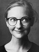
 Karen Charatan
-
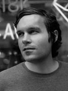
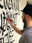
 Ewan Clayton
-
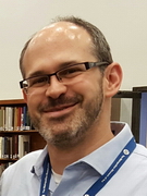
 Andy Clymer
-
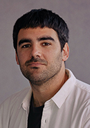
 Stéphane Elbaz
-
 Hannes Famira
-
 Berton Hasebe
-
 Cheryl Akner Koler
-
 Kelli Anderson
-
 Yevgeniy Anfalov
-
 Jared Ash
-
 Martín Azambuja
-
 Peter Bain
-
 Andreu Balius
-
 Ken Barber
-
 Luca Barcellona
-
 Paul Barnes
-
 Jesús Barrientos Mora
-
 Virginia Bartow
-
 Erin Beckloff
-
 Ed Benguiat
-
 Frederik Berlaen
-
 David Berlow
-
 Marta Bernstein
-
 Michael Bierut
-
 Roger Black
-
 Thierry Blancpain
-
 Erik van Blokland
-
 Matteo Bologna
-
 T. Corey Brennan
-
 Tim Brown
-
 Ryan Bugden
-
 Veronika Burian
-
 Christopher Calderhead
-
 Matthew Carter
-
 Juliette Cezzar
-
 Marina Chaccur
-
 Ying Chang
-
 Spencer Charles
-
 G. Scott Clemons
-
 James Clough
-
 Doug Clouse
-
 Stephen ”Stüf” Coles
-
 Stephen Cronin
-
 Andy Cruz
-
 Greg D’Onofrio
-
 Tiziana D’Angelo
-
 Mike Daines
-
 Petra Dočekalová
-
 Eric Doctor
-
 Kelly Doe
-
 Maria Doreuli
-
 Dikko Faust
-
 Tom Foley
-
 Giulio Galli
-
 Oleś Gergun
-
 William Germano
-
 Barbara Glauber
-
 Olivia Glennon
-
 Polina Godz
-
 Todd Goldstein
-
 Romello Goodman
-
 Yuri Gordon
-
 Frank Grießhammer
-
 Allan Haley
-
 Norman Hathaway
-
 Cyrus Highsmith
-
 Jessica Hische
-
 Sofie Hodara
-
 Jonathan Hoefler
-
 Elinor A. Holland
-
 Eric Holzenberg
-
 Nol Honig
-
 Jase Hueser
-
 Shira Inbar
-
 Mark Jamra
-
 Chester Jenkins
-
 Alan Johnson
-
 Jonathan Katav
-
 Scott Kellum
Core instructors
Speakers and guest instructors
Cheryl Akner Koler's interests pivot around how our everyday aesthetic experiences in the physical world drive creative processes. She teams up with partners from different disciplines and professions to help shape the future where aesthetics sensitivities and aesthetic abstractions are interwoven with each other to develop labs, methods and models with the primary goal to expand the field of applied aesthetics for the professional world of art & design.
In her latest artistic research project, HAPTICA (2016-2020) she collaborated with professionals and researchers in the culinary arts to explore haptic perception where we developed aesthetic models and methods between a sculptural/industrial design co ntext at Konstfack, and the culinary arts and performative arts applied in the professional education of chefs and sommelier at Campus Grythyttan, Örebro University. These experiences have profoundly transformed her way of understanding the field of aesthetics by including the proximity sense of smell, taste, and movement in her research and teaching.
Her academic positions/ degrees include Professor Theoretical and Applied Aesthetics at the design program, Konstfack University of Arts, Crafts and Design in Stockholm and Doctor of Philosophy PhD in practice based artistic research, 2007, Chalmers University of Technology, School of Architecture, Göteborg, Sweden.
Kelli Anderson is an artist, designer, animator, and tinkerer who pushes the limits of ordinary materials by seeking out possibilities hidden in plain view. Her books and projects have included a pop-up paper planetarium, a book that transforms into a pinhole camera, and a working paper record. Intentionally lo-fi, she believes that humble materials can make the complexity and magic of our world accessible. She is currently finishing Alphabet in Motion, a book on the relationship between typography and technology with Letterform Archive.
She is also known for her design, animation, and illustration work for NPR, The New Yorker, Wired, MoMA, Pentagram, Tinybop’s award-winning Human Body app, the Exploratorium, and the real New York Times, as well as her redesign of NYC brands such as Russ & Daughters and Momofuku.
Yevgeniy Anfalov is a designer based in Kyiv and Hannover. Born in Kyiv (Ukraine) in 1986, Yevgeniy Anfalov moved to Germany in 2003. He studied Visual Communication at Hannover University of Applied Sciences and Arts, and he launched his design practice in 2010. From 2015 to 2017, he completed the MA Art Direction at ECAL/University of Art and Design Lausanne, with a major in Type Design. His practice as a type designer grew out of his activities in the fields of visual design alongside research in design history and teaching (HAW, Hamburg). His first published font is LL Heymland (Lineto, 2020). Other releases: KTF Jermilov, KTF Rublena, and KTF Compact, LL Atomgrad. Clients include Lineto, Aurèle Sack, Formula Type, Studio ARD, Snøhetta, etc.
Jared Ash is Slavic and Special Collections Librarian at the Thomas J. Watson Library, The Metropolitan Museum of Art, where his primary responsibilities are developing and cataloging Watson’s collections of Russian, Slavic, and rare materials.
From 2006 to 2012, Jared was Curator and Librarian of Special Collections at the Newark Public Library (Newark, NJ), where he curated a number of exhibitions drawn from Newark’s rich collections of artists’ books, illustrated books, fine prints, photographs, and fine printing.
As Curator of the Judith Rothschild Foundation from 1997 to 2002, Jared developed and cataloged a collection of more than 1,200 Russian avant-garde books, periodicals, and works on paper that was donated to the Museum of Modern Art in 2001; he collaborated with MoMA’s Department of Prints and Illustrated Books on the 2002 exhibition, The Russian Avant-Garde Book 1910-1934, and contributed an essay, chapter introductions and more to the accompanying catalog. In addition to the MoMA catalog, Jared also has contributed essays on the Russian avant-garde and book design to publications for the Art Institute of Chicago and the library of the Van Abbemuseum, The Education of a Typographer (edited by Steven Heller), and the journals, Central Booking and Art Documentation.
Jared holds degrees in Russian Studies from Brown University and New York University, and a Master’s in Library and Information Science from Rutgers University.
Martín Azambuja is a Uruguayan Senior Designer at PORTO-ROCHA - Previously Designer at Pentagram - Co-Founder of Estudio Mundial - Vernacular - Gráfica Ilustrada del Uruguay
He is a graphic designer and Illustrator working mostly on Visual Identity and Editorial Illustration.
Peter Bain is a designer and typographer who started work on Madison Avenue and 59th Street in Manhattan. His work has been recognized by AIGA and the Type Directors Club; and published in Communication Arts and Eye. His calligraphic book "Writing Knowledge" is in library special collections at Princeton University and the School of the Art Institute of Chicago. Bain has taught classes and led workshops in Alabama, Georgia, Los Angeles, Mississippi, and NYC.
Andreu Balius is type designer based in Barcelona, Spain. He designs both retail and custom typefaces at Typerepublic (typerepublic.com). Also, he develops self-initiated type projects that involve research and a social approach.
He holds a Ph.D. in Design and is currently teaching typography and type design at EINA – University School of Design and Art in Barcelona.
Andreu Balius is an award-winning typeface designer and has presented lectures, keynotes and workshops internationally. He’s a member of AGI (Alliance Graphique Internationale) since 2010. Also, member of TDC and ATypI.
Ken Barber is a letterer, type designer, author, and instructor. He blames Don Martin comics, Santa Cruz skateboard graphics, and speed metal logos for his obsession with letterforms. For over 25 years, Ken has produced distinctive logos for global brands and created award-winning fonts. His work is part of the Cooper-Hewitt National Design Museum and the Henry Ford Museum of American Innovation. Ken is the type director and studio letterer at House Industries. Author of three books, his award-winning Lettering Manual was released in 2020.
Luca Barcellona hails from Milan, Italy, where he works as a freelance graphic designer and calligrapher in his own studio. He began his career in lettering as an audacious graffiti artist which ultimately led him to the study of classic calligraphy, typography and letterpress printing. In recent years he has been propelled into the forefront of internationally renowned calligraphic artists, conducting workshops and seminars around the world. His works are in the collections of the Harrison in the San Francisco Public Library, the Akademie der Kunst in Berlin, and he teamed up for the reproduction of an old globe from 1500, commissioned from the National Museum of Zurich. Luca has designed logos and advertising campaigns for many leading companies as Nike, Wall Street Institute, Carhartt, Redbull, Lavazza, and a plethora of his highly instructive videos can be found on YouTube. His stunning book “Take Your Pleasure Seriously” is an inspiring collection of lettering art in myriad forms, and is available from John Neal Bookseller
Paul Barnes is a British graphic designer, specializing in the fields of typography & type design. With Christian Schwartz he is a partner in Commercial Type, an internationally renowned typefoundry with offices in London & New York. Graduating from the Typography course at the University of Reading in 1992, he worked in the early 1990s at the studio of Roger Black and later he became the art director of Spin magazine. Since 1995 he has worked independently and in colloboration on a wide range of design projects. With Peter Saville, he has designed logos for clients such as Kate Moss and Givenchy, and created the “Original Modern” concept for the City of Manchester. In 2010 they created the ‘Modern England’ flags for the England football team with sportswear manufacturer Umbro. He has been a design and typographic consultant to many publishers including The Guardian and The Observer Newspapers, GQ, Wallpaper*, Harper’s Bazaar and frieze . As typographic consultant to The Guardian he was involved in the iconic redesign in 2006, and with Christian Schwartz created the new series of typefaces. For this as part of The Guardian redesign team they received the prestigious Black pencil from the D&AD, as well as being nominated for the Design Museum’s Designer of the
Year.
He has designed several retail typefaces, such as the acclaimed Dala Floda and Marian and also corporate typefaces for the National Trust in England and typefaces for magazines as diverse as Condé Nast Portfolio (with Christian Schwartz), O , the Oprah magazine and Vanity Fair. In newspapers he has designed new typefaces for The Daily Telegraph in London and Finland’s leading quality newspaper Helsingin Sanomat. He has also created the letters used by Puma football teams in the 2010 World Cup. In 2009 Schwartz and Barnes set up Commercial Type, an independent type foundry retailing both their own designs, designs by their staff, and other designers. In September 2006, with Schwartz he was named one of the 40 most influential designers under 40 in Wallpaper*. A year later The Guardian named him as one of the 50 best designers in Britain.
Jesús Barrientos Mora is Associate Professor at Benemérita Universidad Autónoma de Puebla. Recipient of the Scaliger Fellowship (2014), author of the book Legado de los Elzevir (2017) and certified in Typeface Design (University of Reading, 2018), he has lectured in institutions like the Dublin Institute of Technology (2015), Universidad Nacional Autónoma de México (2017) and the Sheffield Hallam University (2019). His typefaces are currently distributed through the Monotype channels and have been awarded by the Bienal Tipos Latinos, Bienal Iberoamericana de Diseño, and Premios Clap, participating in many exhibitions across the Americas and Europe.
A graduate of William Smith College (B.A. ‘78) and Columbia University (M.S. ’81) Virginia Bartow is the Sr. Rare Book Cataloger at the New York Public Library. Having worked in the libraries of Cornell University, Columbia University, U. of Illinois Chicago, Dartmouth College, and the New York Public Library she has had the opportunity to work with books from the 10th century to the present. Her interests include bibliographical research and the history of the book and printing. She is a member of the Rare Books and Manuscripts Section of the American Library Association, on the Committee on Fine Printing and the Exhibitions Committee at the Grolier Club, the current Secretary of the American Printing History Association, and Vice-president of the Typophiles.
Erin Beckloff is a letterpress printer, designer, educator, and filmmaker who preserves anecdotal and technical knowledge of printing history and culture. Her research explores letterpress community’s expansiveness through time and how the letterpress printing process will survive through educating others in the craft. She is the co-director and writer of "Pressing On: The Letterpress Film," a documentary about the survival of letterpress and the remarkable printers who preserve the history and knowledge of the craft. Beckloff has given presentations at two Hamilton Wood Type & Printing Museum Wayzgoose conferences; ATypI Antwerp, UCDA Educator’s Summit; College Book Art Association Conferences; and universities around the U.S. She serves as an Assistant Professor of Communication Design at Miami University and holds an MFA in Graphic Design from Vermont College of Fine Arts.
Ed Benguiat (pron. “ben’-gat”;) is an American typographic designer.
Ed Benguiat has hand drawn over 600 new typefaces with out the use of any computers including ITC’s Caslon, Avant Garde Cond, Barcelona, Bauhaus, Korrina, Modern, Souvenir, Tiffany, Bookman, Panache, Edwardian Script, and the self-titled typefaces Benguiat and Benguiat Gothic.
Ed became a partner with Herb Lubalin, in the development of U&lc, lTC's award-winning magazine, and eventually became vice president of the International Typeface Corporation.
He’s designed the logotypes for The New York Times, Esquire, McCall’s, Reader’s Digest, Photography, Look, Sports Illustrated, The Star Ledger, The San Diego Tribune, Ford Motors, AT&T, A&E, Coke, and Estee Lauder... the original logos and posters for films: Planet of the Apes, Super Fly and countless others. You name it, he’s done it.
Benguiat teaches typographic design at the School of Visual Arts in his native New York City.
On November 2, 2000, he was inducted into the Art Directors Club Hall of Fame.
Frederik Berlaen is a typedesigner with a love for programming and scripting. After studying graphical design at Sint-lucas in Ghent, where he got the passion for pure black & white type, he went to study typedesign at the Royal Academy of Art (KABK) in The Hague. He successfully got a Master Degree at the postgraduate course Type & Media in 2006. He is the author of many industry-standard type design applications, like RoboFont and UFOStretch. Frederik Berlaen works under the name of TypeMyType providing font services, programming and teaching at Luca School of Arts Ghent and at ESAD in Amiens.
David Berlow entered the type industry in 1978 as a letter designer for the respected Mergenthaler, Linotype, Stempel, and Haas typefoundries. He joined the newly formed digital type supplier, Bitstream, Inc. in 1982. After Berlow left Bitstream in 1989, he founded The Font Bureau, Inc. with Roger Black. Font Bureau has developed more than 300 new and revised type designs for The Chicago Tribune, The Wall Street Journal, Entertainment Weekly, Newsweek, Esquire, Rolling Stone, Hewlett Packard and others, with OEM work for Apple Computer Inc. and Microsoft Corporation. The Font Bureau Retail Library consists mostly of original designs and now includes over 500 typefaces. Berlow is a member of the New York Type Directors Club and the Association Typographique International, and remains active in typeface design.
Marta Bernstein is a designer, researcher, teacher and co-founder of the digital type foundry CAST. Type and typography are her true passions and the common threads of all her projects. She has a soft spot for 19th Century type, a topic she’s been researching for a decade. She’s given talks on various type topics at Typographics NYC, ATypI, The Letterform Archive, Typelab, Kerning Conference. She is a member of Nebiolo History Project, aiming to research archival evidence of Italy’s most renowned type foundry.
Marta collaborates with international companies, start-ups and public institutions internationally. She has decade long experience in developing identities across various media, designing exhibitions, and signage systems. She is currently Associate Creative Director at Studio Matthews in Seattle.
Her teaching roles have included: part-time faculty at USC Roski, adjunct professor in Typography at Milan’s Polytechnic University, visiting professor in Architecture and Design at the University of Navarra, and lecturer for the Interior Design master at Tongji University, Shanghai.
Marta completed her B.Sc. & M.Sc. in Graphic Design at Milan’s Polytechnic and her M.Des in type design at the Royal Academy of Art in The Hague.
Follow Marta on Twitter and Instagram.
Michael Bierut studied graphic design at the University of Cincinnati’s College of Design, Architecture, Art, and Planning, graduating summa cum laude in 1980. He worked for ten years at Vignelli Associates before joining Pentagram as a partner in 1990.
His clients at Pentagram have included The New York Times, Saks Fifth Avenue, The Robin Hood Foundation, MIT Media Lab, Mastercard, Bobby Flay Bold Foods, Princeton University, the New York Jets, the Brooklyn Academy of Music, and Playwrights Horizons. As a volunteer to Hillary Clinton’s communications team, he designed the H logo that was ubiquitous throughout her 2016 presidential campaign.
Bierut served as president of the New York Chapter of the American Institute of Graphic Arts (AIGA) from 1988 to 1990 and is president emeritus of AIGA National. He also serves on the boards of the Architectural League of New York and the Library of America. Bierut was elected to the Alliance Graphique Internationale in 1989, to the Art Directors Club Hall of Fame in 2003, and was awarded the profession’s highest honor, the AIGA Medal, in 2006. He was winner in the Design Mind category at the 2008 Cooper-Hewitt National Design Awards. In 2016, he was the Henry Wolf Resident in Graphic Design at the American Academy in Rome.
Bierut is a senior critic in graphic design at the Yale School of Art and a lecturer in the practice of design and management at the Yale School of Management. He is a cofounder of the website Design Observer and is the co-editor of the five-volume series Looking Closer: Critical Writings on Graphic Design published by Allworth Press. Michael’s book 79 Short Essays on Design was published in 2007 by Princeton Architectural Press. A monograph on his work, How to use graphic design to sell things, explain things, make things look better, make people laugh, make people cry and (every once in a while) change the world was published in 2015 by Harper Collins. His collection of new essays, Now You See It, was published in fall 2017.
This year Roger Black is starting a new magazine about type, Typographics. He helped organize the conference by the same name, which has been held the last two years at Cooper Union, New York.
Since LA in 1972, Roger has been chief art director or design consultant for publications all over the world. Among them: Rolling Stone, New York, The New York Times, Newsweek, Esquire, Reader’s Digest, The Los Angeles Times, MSNBC.com, Bloomberg.com, The Washington Post, Semana (Colombia), Panorama (Italy), The Straits Times (Singapore), Kompas (Indonesia), The Nation (Bangkok) Tages Anzeiger (Switzerland), Placar (Brazil), Svenska Dagbladet (Sweden), Scientific American.
He’s been involved in many startups. Some, like Outside, Fast Company and Out, are continuing success stories.
He’s a director at Type Network, a new firm that exclusively offers the typefaces of leading digital type foundries, including Font Bureau, which Roger co-founded in 1989.
Roger continues to spend time in Asia, and at homes in Pass-a-Grille, Florida, and Marathon, Texas.
Thierry Blancpain is a freelance designer and art director living in New York City. Together with Noël Leu he co-founded Swiss foundry Grilli Type in 2009. He received his BA in Visual Communication from the Bern University of the Arts, Switzerland, and has been teaching at his alma mater’s MA Communication Design course for two years.
Erik van Blokland, a type designer from The Hague, Netherlands, started the LettError foundry with Just van Rossum in 1989. He studied graphic design at the Royal Academy of Arts in The Hague, and picked up the taste for type design in Gerrit Noordzij's class. The early experiments in type and code (Beowolf, Trixie, Hands) were published by FontFont. More recently Eames Century Modern at House Industries and lots of work for Photo-Lettering. Tool development became an important part of Erik's work (see Superpolator). First with Petr van Blokland and Just van Rossum in RoboFog. Later with Tal Leming in the RoboFab and UFO projects and the initial stages of the WOFF specification for webfonts. Van Blokland is a senior lecturer at the TypeMedia course of the Royal Academy of Arts.
Matteo Bologna is the principal of Mucca Design, where he also serves as Creative Director. Under his direction, the Mucca Design team has solved numerous design challenges and created uniquely successful work for a wide variety of global companies like Sephora, Whole Foods, Victoria’s Secret, WeWork, Adobe Systems, Bacardi and Danone. With his team he designed the identities for a variety of now classic New York City culinary destinations like Balthazar’s and Frenchette.
Matteo is a past chairman of the Type Directors Club and former board member of AIGA/NY. He frequently lectures about branding and typography around the world.
T. Corey Brennan is associate professor of Classics at Rutgers University-New Brunswick; he also taught at Bryn Mawr College. Brennan was appointed Andrew W. Mellon Professor in the American Academy in Rome, 2009-2012. His books are The Praetorship in the Roman Republic (2 vols., Oxford 2000) and (with Harriet I. Flower) co-editor of East and West: Papers in Ancient History Presented to Glen W. Bowersock (Harvard 2009), and has written many contributions on Roman history and culture.
Tim Brown is a designer, writer, speaker, and toolmaker, with a focus on typography. Formerly a web designer at Vassar College, he is now Type Manager for Adobe Typekit ("The best way to use fonts"), a curator for A List Apart ("For people who make websites"), and the author of Nice Web Type ("For the betterment of typographic style and practice") (@nicewebtype on Twitter).
After making Modular Scale ("Meaningful typographic measurement") and Web Font Specimen ("Real web type in real web context"), Tim wrote about each in two all-time staff favorite A List Apart articles ("More Meaningful Typography and Real Web Type in Real Web Context"). His ideas about Molten Leading inspired jQuery plugins for fluid line-height. He has spoken at Inspire and Build, participated in AIGA Breakthroughs, and appeared on The Big Web Show ("Everything web that matters") with Jeffrey Zeldman.
Tim lives and works in New York State’s beautiful Hudson Valley with his wife and college sweetheart, Eileen, their two daughters, and two dogs.
Ryan Bugden is an independent typeface designer and graphic designer based in Brooklyn. He runs a design practice with his partner Michelle Ando, releases typefaces through Future Fonts, teaches typeface design through his own Type Sessions, and is an adjunct professor of typography at SVA. Before graduating from Type and Media in 2019, he studied graphic design at RISD and typeface design at Type@Cooper’s Extended Program, and worked as a senior designer at studios such as Red Antler and Pentagram.
Zrinka is a Croatian type and graphic designer currently based in Mexico.
She holds a Masters degree in Typeface Design from TypeMedia Programme at KABK, Netherlands, and is a graduate of Type@Cooper’s Condensed Program in New York. She also holds a Masters degree from Art Academy of Split Croatia in New Media Design and a Baccalaureus Degree in Visual Communication Design.
Having previously worked as a UX/UI and Visual designer for a decade, her work focuses mainly on blending type, digital media and printing techniques.
Currently she runs DualType studio with Gen Ramirez.
Veronika Burian born in Czech Republic, is a product and type designer running the international indie foundry TypeTogether with partner José Scaglione since 2006, today with twelve employees working around the world. She graduated from FH München, Germany, in Industrial Design and holds a MA in Typeface Design from the University of Reading, UK. Veronika is one of the organisers of the Alphabettes mentorship program, co-chairwoman of the GRANSHAN project, co-curator/organiser of TypeTech MeetUp, and guest lecturer at the Faculty of Architecture and Design NTNU in Norway.
Christopher Calderhead is a lettering artist, designer, and author. He is the editor of Letter Arts Review, an international quarterly magazine dedicated to original lettering, type design, calligraphy, and text-based art. He is the author of Calligraphy Studio and, with Holly Cohen, The World Encyclopedia of Calligraphy. For the past ten years, he has taught design and calligraphy in the Undergraduate Communications Design department at the Pratt Institute.
Matthew Carter is a type designer with fifty years’ experience of typographic technologies ranging from hand-cut punches to computer fonts. After a long association with the Linotype companies he was a co-founder in 1981 of Bitstream Inc., the digital typefoundry, where he worked for ten years. He is now a principal of Carter & Cone Type Inc., in Cambridge, Massachusetts, designers and producers of original typefaces. His type designs include ITC Galliard, Snell Roundhand, Shelley Script, Helvetica Compressed, Olympian (for newspaper text), Bell Centennial (for the US telephone directories), ITC Charter, and faces for Greek, Hebrew, Cyrillic and Devanagari. For Carter & Cone he has designed Mantinia, Sophia, Elephant, Big Caslon, Alisal and Miller. Starting in the mid-’90s Carter has worked with Microsoft on a series of “screen fonts” designed to maximize the legibility of type on computer monitors. Of these, Verdana, Tahoma and Nina (a condensed face for hand-held devices) are sanserif types; Georgia is a seriffed design.
Juliette Cezzar is an Assistant Professor of Communication Design at The New School’s Parsons School of Design where she was Director of the BFA Communication Design and Design & Technology programs from 2011–2014. She served as president of AIGA New York’s board of directors from 2014–16.
Marina Chaccur is a designer based in The Hague, where she works part-time for Type Network, teaches type design at KABK, and also works at her studio Marina Chaccur Designs, focusing on residential interior design projects. She holds a degree in Industrial Design from Fundação Armando Alvares Penteado, an MA in Graphic Design from the London College of Communication and an MA in Type and Media from the Koninklijke Academie van Beeldende Kunsten. Marina has been involved in conferences, lectures, workshops and exhibitions worldwide, also having served as board member for Association Typographique Internationale.
Ying Chang is a letterer, designer, and art director based in NYC.
Growing up in Taiwan, she was deeply influenced by her mother, a calligrapher, and her father, a painter. Ying followed in her parents' footsteps and attended the National Taiwan University of Arts. After earning her bachelor’s degree in Visual Communication Design, she bought a one-way ticket to New York to further her study at the Pratt Institute—finishing with a master’s degree in Communication Design.
After taking her first calligraphy class, Ying was inspired to dive even deeper at the Type@Cooper Extended Typeface Design Program where her true passion for lettering came into focus. Since then, she can’t seem to put her pencil down and has been creating logotypes and lettering works for different brands, publications, and self-initiated projects. Her lettering works have been recognized and published by a variety of organizations while she continues to contribute her design skill to the world of advertising where she has produced award-winning campaigns.
Follow her on Instagram: @yinglish
Karen Charatan creates pen, brush, and drawn lettering as well as calligraphic paintings. The range of work in her 30-year career includes advertising lettering, greeting cards, point-of-purchase displays, murals and sign design. Karen has taught brush lettering, business card design and sign writing for the annual international lettering arts conferences and for many of the calligraphy guilds in the USA, Canada, Europe and Japan. She exhibits her abstract calligraphic paintings with a group of Asian and Western fine artists. Her works are included in the collection of the Mobile Museum of Art in Mobile, AL.
Spencer Charles is a Brooklyn-based typeface designer and partner at Undercase Type. They are a graduate of the Type@Cooper Extended program at the Cooper Union. From 2011-2014, they were Senior Designer at Louise Fili Ltd, and have been a partner at Charles&Thorn, a boutique typographic and illustration studio, since 2015. They have published typefaces through Lost Type and Future Fonts, have taught typography at the School of Visual Arts in New York City, and have served as Communication Judge for the Type Directors Club 2017 annual competition.
Ewan is a calligrapher and part-time Professor in Design at The University of Sunderland where he co directs the International Calligraphy Research Centre. He grew up associated with a community of craftsmen at Ditchling in Sussex founded by Eric Gill. Ewan has enjoyed a varied professional career working as both a calligraphy teacher and a consultant to Xerox PARC, and he is currently a core faculty member at the Royal Drawing School in London. In 2013 he was awarded the first Karl-Georg Hoefer prize by The Schreibwerkstatt Klingspor for his work in calligraphy and education. His book on the history of calligraphy and typography The Golden Thread is out in paperback this year in the USA and has recently been released in Spanish and Italian translations.
G. Scott Clemons has collected the Aldine Press since his days as an undergraduate in the Classics Department at Princeton University. He currently serves as the President of the Grolier Club, Treasurer of the Bibliographical Society of America, and is a past Chairman of the Friends of the Princeton University Library. Outside of his bibliophilic interests, Scott is the Chief Investment Strategist of Brown Brothers Harriman & Co., a privately-owned investment firm in New York City. Scott curated the exhibition Aldus Manutius: A Legacy More Lasting Than Bronze, on display at the Grolier Club this past spring, and is the co-author of a companion volume to the exhibition, soon to be available from Oak Knoll Books.
Following his training in typographic design at the London College of Printing, James Clough moved from London to Milan in 1971 and pursued a career in typography, lettering and calligraphy. In 1991 he was a founding member of the Associazione calligrafica Italiana and in 2016 he was convenor of an international conference in Milan on the future of handwriting. For the past thirty years he has deepened his knowledge of the history of writing, type and the graphic arts and he has lectured on these subjects in Italy and various European countries as well as the USA. Besides his many articles and lectures on Bodoni, Clough is the author of Alphabets of Wood, a history of Italian wood type, and Signs of Italy. From 2016 to 2019 the Italian newspaper La Repubblica published his Sunday column on historical and modern Italian inscriptions and signs. In 2021, as a member of the Nebiolo History Project, he gave a talk for the Herb Lubalin Lecture Series on Microgramma and Eurostile and another on Bodoni.
Doug Clouse is a graphic designer and teacher who lives in New York City. He wrote MacKellar, Smiths & Jordan: Typographic Tastemakers of the Late Nineteenth Century, and co-wrote The Handy Book of Artistic Printing with Angela Voulangas.
Andy Clymer is a typeface designer and developer living in New York City and has been an instructor in the Type@Cooper program since 2011. He received a Bachelor of Arts degree in graphic design from San Diego State University and a Master of Design degree in type design from the Type & Media postgraduate course at the Koninklijke Academie van Beeldende Kunsten (Royal Academy of Art) in The Hague, Netherlands. Until May of 2018, Andy had worked for almost thirteen years at the Hoefler&Co. type foundry, where he contributed to the typefaces Vitesse, Forza, Ideal Sans, Archer, Surveyor, and spearheaded the design of Operator and Obsidian.
Stephen “Stüf” Coles (he/him) is Associate Curator & Editorial Director at Letterform Archive. Previously, he served as FontShop’s creative director and a member of FontFont’s TypeBoard. He was also an independent consultant, connecting font makers with font users and advocating for the interests of both groups. Stephen wrote the book The Anatomy of Type and co-founded the websites Typographica and Fonts In Use.
Stephen Cronin is a front-end web developer working at The Outline living in Queens. After moving to NYC seven years ago he has spent his time working at web agencies, start ups, and editorial websites including Code and Theory, HYPERHYPER, and The Intercept. He has worked with many renowned designers in the web industry executing high-fidelity designs. During his free time he enjoys creating hand lettering artwork and practicing calligraphy. He has received calligraphy training through public workshops at Type@Cooper and Society of Scribes.
Andy spent his early years learning the dark arts of hot rodding from his father and skating the mean streets of Elsmere, Delaware. After graduating from Delcastle Vocational and Technical High School with “shop” certification in Commercial Art, he opted to skip art school and get right to work. As the art director and creative nerve center of House Industries, Andy uses his calm, quiet demeanor to cajole frustrated House artists, designers and collaborators into forgeting the rules for a just moment to figure out the best way to create something worthwhile. His work is in the permanent collection of the Smithsonian Institution’s Cooper-Hewitt, National Design Museum, and the Henry Ford Museum of American Innovation. Andy recently completed the book House Industries: The Process is the Inspiration with co-authors/long time conspirators Rich Roat and Ken Barber. If he’s not collecting furniture, Japanese folk art or other junk that will somehow turn into a House Industries design project, he’s spending time with his ladies: wife Stephanie and daughters, Ava and Mia.
Greg D’Onofrio is a designer, writer, educator, and co-founder of Display, Graphic Design Collection. Greg has curated, lectured, and written about topics ranging from Bruno Munari and Lester Beall to Elaine Lustig Cohen and Morton and Millie Goldsholl. Greg teaches Graphic Design History at the School of Visual Arts and Cooper Union in New York City. He is co-author of The Moderns: Midcentury American Graphic Design and Italian Types: Graphic Designers from Italy in America.
Tiziana D’Angelo received her Ph.D. in Classical Archaeology from Harvard University in 2013. She is currently a Jane and Morgan Whitney Postdoctoral Fellow in the Department of Greek and Roman Art at the Metropolitan Museum of Art. She holds a B.A. in Classics from the Università degli Studi di Pavia, Italy, and an M.Phil. in Classical Archaeology from the University of Oxford. Her research and curatorial interests include Greek, Roman, and Etruscan art and archaeology. D’Angelo has participated in archaeological excavations in Italy and Turkey, and held research fellowships in Cambridge (St. John's College), Oxford (St. Hugh's College), Rome (Phi Beta Kappa Society), Los Angeles (Getty Research Institute), and Berlin (Deutsches Archäologisches Institut).
Mike Daines studied typographic design at the London School of Printing in the 1960s and began his career as a type designer in the London studios of Letraset, where he designed a number of typefaces, notably Hawthorn and University Roman. He worked in display photosetting at Alphabet and TypeShop, then, as a director of Letraset’s Typographic Systems Division, he managed URW, Hamburg, involved in the installation of the Ikarus type digitization systems for Monotype, Compugraphic, Berthold and Linotype. Mike later founded Baseline magazine, Applied Graphics Limited, co-founded Applied Arabic, an Arabic type design licensing company, and The Foundry (with David Quay and Freda Sack), an early digital typefoundry. In 2003 he established eLexicons Limited, to develop interactive learning resources, where he edited and published the eLexicon of Typography.
Petra Dočekalová is a typographer and letterer based in Prague, Czech Republic. Since 2013 she is a member of Briefcase Type Foundry team. She received TDC Award of excellence for her diploma project dealing with the Czechoslovak calligraphy and new hand lettering forms. Petra will finish her PhD studies at the Type Design and Typography studio at UMPRUM Academy in Prague this year with her thesis focusing on school cursive and handwritten typefaces, their applications and overlap from the academic to the practice and educational environment. She is also focused on editorial work such as book Typo9010, that won several awards all over the world including TDC Award of excellence and her recent project is the book about Jaroslav Benda 1882–1970, Typographic designs and letterforms.
Eric Doctor is a graphic & type designer and teacher in New York City with over a decade of experience working with and for good people. He is a Senior Designer at The Unemployed Philosophers Guild, where he has been a dues-receiving member in good standing since 2014. He teaches typography at Parsons School of Design and has also taught graphic design, type design, typography, and branding at Miami Ad School New York and The Creative Circus. Eric lives in Brooklyn with his dog Vector and is a proud alum of Rice University, Creative Circus, and Type@Cooper.
Kelly Doe is the Design Director for Brand Identity at The New York Times, where she is currently focusing on video, new digital products and the creation of company-wide brand guidelines. Her work involves close collaboration with creative groups from across the company including editorial, product, corporate, extended brand and marketing. Some of her past projects include developing prototypes for the first Times Reader, the redesign of the International Herald Tribune and leading the 2014 rebrand of Times Video.

Kelly's national and international clients have included the museums of the Smithsonian Institution, the National Archives, news organizations and magazines in Asia, Europe and Latin America, and a wide range of publishers, artists and non-profits. She recently completed a 75th Year anniversary book for the National Gallery of Art and is consulting with the Freer and Sackler Museums of the Smithsonian on video installations. Happily, one of her current projects is a book and film on the visual history of The New York Times. Kelly’s design, art direction and creative collaborations have been recognized by awards in the worlds of advertising, editorial and fine art.
Maria Doreuli is the founder of an independent studio Contrast Foundry. In 2018, craving for new challenges, she relocated to California. Focusing on type design, Maria believes in the power of emotion and working with passion. She’s open to new opportunities and aims to experiment more to find unexpected forms of expression.
Traditional and experimental, self initiated and commercial, her projects have been honored by many international awards—ADC, Communication Arts, Morisawa, Red Dot and Type Directors Club (New York) among others.
Originally from Paris, France, Stéphane Elbaz is a graphic and type designer currently living and working in New York City. He recently joined First Look Media where he serves as Head of Product Design, Magazines. In the last few years he devoted much of his time to digital publishing platforms. In addition, he continued his type and brand design practice.
For Code and Theory he led visual design on various projects including Vanity Fair and GQ for Condé Nast France, the LA Times, Interview, and Art in America. As an independent designer, Stephane recently created a brand typeface for Sephora and participated in brand projects for companies in sectors ranging from culture and fashion to the energy industry. In 2009 he was awarded the Certificate of Excellence in Type Design from the Type Directors Club of New York for his type family Geneo.
Hannes Famira is founding principal of FamiraFonts. He is a graphic designer, a type designer and a teacher of both disciplines. After 20 years in the Netherlands, Germany and Switzerland he now lives in Brooklyn, New York.
His library of retail typefaces is available from Adobe Fonts, Type Network and I Love Typography. You can see work in progress at Dribbble. Companies like Céline, Helmut Lang, GoDaddy, Mansur Gavriel and Theory have commissioned custom tailored logo and corporate typeface solutions. Most recently Hannes drew a typeface for the opening titles of the AMC television show Interview With The Vampire.
Hannes’ understanding of type comes mostly out of his Dutch design education at the Royal Academy in The Hague (KABK). With a painter for a mother and neo-modernist architect for a father his earliest influences are based in a love for Scandinavian and traditional Japanese design. Combining the freedom of painting with the structured thinking of architecture seems to have quite naturally led him to type design at the center of his creative work.
After having worked at Meta Design, at the Buro Petr van Blokland and at House Industries Hannes started his own design studio Das Kombinat in 1999. He added Kombinat-Typefounders in 2001 and renamed it FamiraFonts in 2016.
An ongoing practice of teaching type has been the most formative influence on Hannes’ thinking since his years as a student at KABK. He has been teaching in the Type@Cooper Extended and Condensed programs at the The Cooper Union since January 2011. Hannes also taught various typography and type design classes at the Basel School for Design in Switzerland, at The Cooper Union New York City, SVA the School of Visual Arts, the UArts in Philadelphia, the New Jersey City University, the Hochschule für angewandte Wissenschaft und Kunst Hildesheim/Holzminden/Göttingen, the Kunsthochschule Kassel, Rutgers University and the City University of New York.
Dikko Faust founded Purgatory Pie Press, one of the longest running artist/presses. Purgatory Pie Press limited editions are in public and private collections worldwide including MoMA, the Metropolitan Museum, the Cooper Hewitt, and London's V&A and Tate Modern. Dikko had taught letterpress and run the letterpress shop at Cooper and now teaches at School of Visual Arts where he was instrumental in setting up their type shop.
Tom Foley is a graphic designer, typographer and type designer currently living and working in London. Tom earned his BA in Visual Communications from Limerick School of Art and Design in 2007 and MA from Central Saint Martins in 2009. Prior to joining Dalton Maag he worked with Polimekanos, Micha Weidmann Studio, Atelier Dreibholz and Atelier David Smith. Tom also occasionally teaches design and has carried out lectures and workshops at Universities including Central Saint Martins, University of West England, Limerick School of Art & Design, Dun Laoghaire Institute, University of Santa Clara, Ravensbourne and SVA New York. From 2011 - 2015 Tom worked as a full time Font developer at Dalton Maag where he has been involved in custom and library Type design projects covering Latin, Greek, Cyrillic, Tamil and Bengali script systems. Tom currently works as Senior Typographic Advisor at Dalton Maag.
Giulio Galli is a typeface designer, researcher and teacher based in Brussels, Belgium. Born and raised in Pesaro, Italy, he got a BA in Graphic Design at ISIA Urbino in 2019 and moved to specialize in Typeface Design at the University of Reading in 2021. He is currently conducting research in typography and legibility at READSEARCH Research Lab and teaching typeface design and typography at PXL-MAD School of Arts in Hasselt, Belgium. Since 2018 he is also associate of CAST Foundry (Cooperativa Anonima Servizi Tipografici), a type foundry set up as a cooperative in Bozen, Italy.
Oleś Gergun is a digital designer and developer based in Kyiv and Leipzig with a background in Cultural Studies. He gained a degree of Master of Arts in Culturology at Kyiv-Mohyla Academy. Subsequently, he became a designer through an autodidact will, not least because of his interest in creative coding. In his practice, he applies both design and code for commercial and non-commercial clients. Being a critical mind and a dedicated practitioner, he applies his analytical and strategic approach to KTF. His type design practice is a continuation of his Kyiv Type Digest blog, an ongoing research of vernacular typography in Kyiv. His typographic debut is a contribution to our shared project KTF Jermilov.
William Germano received his B.A. from Columbia and his Ph.D. in English from Indiana University. He was appointed dean and has taught at Cooper Union since 2006. He teaches the freshman core, as well as courses on Shakespeare, opera, the history of the book and an elective on puppets and robots.
Barbara Glauber founded the New York-based design studio Heavy Meta in 1990. The studio focuses on projects for cultural institutions, collaborating with artists, curators, and editors to create publications, interdisciplinary exhibitions, information graphics, and identities. She has designed over 90 books for clients such as the Whitney Museum, Bard Graduate Center, the Guggenheim Museum, The New School, LACMA, Carnegie Museum of Art, Tang Museum, Morgan Library, Dartmouth College, Philadelphia Museum of Art, and the Brooklyn Museum. Her publications have been selected for the AIGA 50 Books 50 Covers 17 times and won numerous awards including the Alice Award for the most beautiful illustrated book. She has had the privilege of working on monographs for notable subjects such as Someday is Now: The Art of Corita Kent, Hilma af Klint, and Kehinde Wiley. Barbara has an MFA from CalArts, teaches design at Yale and Cooper Union, and is a co-curator of the Typographics Conference.
Olivia Glennon is a designer, software engineer, and project lead for Fathom Information Design in Boston, MA. With Fathom, she has worked on projects for GE, National Geographic, and Mayo Clinic. Currently, she leads Fathom’s efforts in building tools for scientists and response teams studying and working to contain the spread of COVID-19. She graduated from the Cooper Union with a BFA in 2014.
Polina Godz is an art director at the Tribune magazine, and a graphic designer at the Jacobin magazine. She holds a BFA in Graphic Design from the Rhode Island School of Design, and a BA in Modern Culture and Media from Brown University. She was a part of the Type@Cooper Extended program in 2020–21 and is still working on a few projects started then. She is originally from Kharkiv, Ukraine.
is a designer, art director, animator, and musician originally from Boston, MA. Formerly Associate Partner on Emily Oberman’s team at Pentagram New York, now freelance in Portland, OR.
Romello Goodman is a DC-based Designer who specializes in applying computational techniques to web technologies and printmaking. He is a Design Technologist at Block working on their Brand and Purpose team and an Adjunct Faculty member in the Graphic Design department at MICA.
As a technologist, I examine the computer’s role in the creative process through the practice of printmaking. Through the introduction of computational and generative techniques, I create ways of imbuing individuality and specificity into each graphic.
I — — o Gordon — a man from another planet. He’s not on TickTock, doesn’t watch TV shows, doesn’t listen to music, and considers himself an avatar for a poet. He’s designed hundreds of typefaces but is not a typeface designer. He wrote the “Book of Letters From Аа to Яя” — the first ever book about the anatomy of the Cyrillic alphabet — in order to really understand the alphabet. He invented the best software for making letters (unfinished as of yet). He coined several important typographic terms that are not yet in the English language. For the last 10 years he’s been making literary maps of cities, each more elaborate than the last.
Frank Grießhammer has been working as a type designer and font developer with Adobe since 2011.
Before coming to California, he graduated from the Type and Media masters program at the Royal Academy of The Hague in 2010, worked for FSI FontShop International in Berlin, and studied graphic design at Saarbrücken, Germany, and Florence, Italy.
Allan Haley is Director of Words & Letters at Monotype Imaging. Here he is involved in all aspects of building and maintaining the company’s typeface library. Mr. Haley is also responsible for educational content for the company’s web sites and is an important link between Monotype Imaging and the graphic design and design education communities.
Prior working for Monotype Imaging, Mr. Haley was principal of Resolution, a consulting firm with expertise in fonts, font technology, type and typographic communication. He was also executive vice president of International Typeface Corporation.
Mr. Haley is ex officio Chairman of the Board of the Society of Typographic Aficionados, and past President of the New York Type Directors Club. He is highly regarded as an educator and is a frequently requested speaker at national computer and design conferences. Mr. Haley is also a prolific writer, with six books on type and graphic communication and hundreds of articles for graphic design publications to his credit.
Berton Hasebe is a type designer living in New York. From 2008–2013 he worked at Commercial Type, helping to develop typefaces for retail release, and custom typefaces for clients including Bloomberg Businessweek, The New York Times, Nike, and Wallpaper*. Through Commercial Type he's released the typefaces Druk, Portrait and Platform. Since 2013 he's worked independently and teaches typography at Parsons The New School for Design and type design at the University of the Arts in Philadelphia.
Berton received his bachelors degree in graphic design from Otis College of Art and Design in 2005, and moved to the Netherlands in 2007 to study type design at the Type and Media masters program at The Royal Academy of Art in the Hague (KABK). His typeface Alda, designed while attending Type and Media, was awarded the 2008 judges pick from the Type Directors Club in New York and was released by Emigre in 2011.
Berton's work has been recognized by the ATypI, BRNO Biennale, TDC, and Tokyo TDC. In 2012 he was featured as one of Print Magazine’s New Visual Artists.
Norman Hathaway is an art director and design historian. He is the author of Overspray and co-author with Dan Nadel of Electrical Banana: Masters of Psychedelic Art and Dorothy and Otis: Designing the American Dream. He has led creative initiatives for institutions including The Design Museum, London and the Royal Academy of Arts, as well as artists including Paul McCartney. He has taught widely on the history of design and typography for the London College of Printing, The Royal College of Art, and Goldsmiths College.
Cyrus Highsmith is a letter drawer, teacher, author, and graphic artist. He teaches type design at Rhode Island School of Design (RISD). He wrote and illustrated the acclaimed primer Inside Paragraphs: Typographic Fundamentals. In 2015, he received the Gerrit Noordzij Prize for extraordinary contributions to the fields of type design, typography, and type education. In 2017, he became Creative Director for Latin Type Development at Morisawa USA. He goes to bed very early.
Jessica Hische is a letterer, illustrator, graphic designer, and typeface designer living in Brooklyn, NY. You may know Jessica through her various projects, like Don’t Fear the Internet, Daily Drop Cap, Should I Work for Free?, or Mom, this is how twitter works.
Jessica previously worked at Louise Fili Ltd where she was Senior Designer. She has worked for clients such as Tiffany & Co., Victoria’s Secret, American Express, Target, New York Times, Boston Globe, Chronicle Books, Random House, and Penguin Books to name a few. Her work has been featured in most major design and illustration publications including Communication Arts, Print magazine, STEP magazine, HOW magazine, Graphis, American Illustration, and the Society of Illustrators annual. She was featured in 2009 as one of STEP magazine’s 25 emerging artists and as one of Print magazine’s New Visual Artists 2009.
She very much enjoys good food, black coffee, and her two cats, Olive and Billy.
Sofie Hodara is a Boston-based multimedia artist, designer, and educator. Her work explores the intersection between traditional and cutting-edge media in order to create beautiful, non-utilitarian experiences with technology. She is a member artist at Bromfield Gallery (Boston MA) and frequent collaborator with colleague and friend, Martha Rettig. She teaches design at Massachusetts College of Art and Design, SMFA at Tufts University and Emmanuel College. She lives in Brookline with her partner, Nate, and lots of art on the walls.
Jonathan Hoefler has been designing typefaces since 1989. His company, Hoefler & Co., is home to one of the world’s most distinguished font libraries, designs such as Knockout, Gotham, Mercury and Archer that are known for both high performance and high style.
Hoefler has been awarded both the Prix Charles Peignot for outstanding contributions to type design, and the AIGA Medal, the design profession’s highest honor. A two-time honoree of the National Design Award, H&Co’s work is in the permanent collections of both the Smithsonian Institution and the Museum of Modern Art in New York.
Elinor A. Holland, a student of both Arabic and English calligraphy for over twenty years, has taught calligraphy to students of all ages at schools, museums, and other learning institutions since 1994, including the New York Public Library, The Smithsonian Institute, the Center for Book Arts, and the Metropolitan Museum. Her freelance work includes private and commercial commissions.
Eric Holzenberg is Director of the Grolier Club of New York, America's oldest and largest society for enthusiasts in the book and graphic arts. Since 1994 he has shaped the Grolier Club's mission to celebrate the enduring value of the book-as-object, promoting the Club's 100,000-volume research library on books and printing, its 128-year-old series of public exhibitions on bookish themes, and its venerable roster of finely printed books-on-books. A former chair of the Rare Books & Manuscripts Section of ALA/ACRL, and past president of the American Printing History Association, Mr. Holzenberg holds an MA in library science from the University of Chicago, where he specialized in rare books and manuscripts; and an MA in history from Loyola University of Chicago. Among other books for the Grolier Club, he is the author of The Middle Hill Press (1997), and co-author of For Jean Grolier & His Friends: 125 Years of Grolier Club Exhibitions & Publications, 1884-2009. He has in addition written numerous articles, and lectured widely, on various topics in bibliography, bibliophily, and book history. His course on "The Printed Book in the West Since 1800" has been taught annually at the University of Virginia's Rare Book School program since 1998, and he is also an adjunct faculty member of the Rare Books Program of the Palmer Library School of LIU. Mr. Holzenberg is an avid collector of (among many other things) books on architecture and design, particularly the English Gothic Revival, and the Aesthetic Movement in Europe and America.
Nol Honig is a director, designer, and animator in New York City. In his spare time, he can often be found wearing neckties.
Over the years he has worked with an impressive array of clients, including Coca-Cola, CBS, MTV, YouTube and the Philadelphia Museum of Art. In 2012 he was one of the lead motion designers for Barack Obama's presidential campaign.
Aside from his client work, Nol is also a passionate educator. In 2017 he received a Distinguished Teaching Award for his work teaching motion graphics at Parsons School of Design. He also is the creator of the popular online class After Effects Kickstart at School of Motion.
In addition to work with The Drawing Room, Nol is a regular contributor to the industry blog Motionographer where he has profiled some of the most innovative and interesting people working in motion graphics today. In 2017 he was an advisory board member and short-list judge for the Motion Awards, the first award show exclusively for the field of motion design.
Jase Hueser is a graphic and motion designer specializing in identity design and animated media. He currently works at Pentagram with partner, Emily Oberman, designing and leading the motion-related aspects of identity development with clients such as Saturday Night Live, Warner Bros., Netflix, NBC, PBS, Amazon Prime Video, Film Independent and many more. His work has been recognized by AIGA, AAF, and TDC. Originally from Omaha, Nebraska, he holds a BFA in Visual Communication Design from the University of Nebraska at Kearney and now lives in Brooklyn, NY.
A graphic designer with an edge of motion, making work in broadcast, nightlife, media, and event production. She’s a founding member of Little Cinema, an immersive theatre company based out of House of Yes, Brooklyn, and maintains an active practice of collaboration with studios, nonprofits, and creative individuals of all kinds. She partnered with AIGA Eye on Design Magazine to design the Psych issue, winning Stack Magazine’s Cover of the Year for 2018. She has made work for Pentagram, Medium, The New York TImes, New Yorker Magazine, GIPHY, Squarespace, The FADER, and MTV News; attempting to make cable television relevant again via interstitials, GIFs, broadcast takeovers, and general randomness. Shira holds a BFA from Bezalel Academy of Arts and Design, Jerusalem, and an MFA from Yale University, and currently teaches motion graphics at Parsons School of Design in New York City.
Mark Jamra is a type designer and professor at Maine College of Art, who has designed and produced typefaces for over 35 years. He is the founder of TypeCulture, a digital type foundry and academic resource, and is a founding partner of JamraPatel, a studio focusing on type design for under-supported language communities. Mark has taught graphic design, lettering, typography and type design at colleges and workshops in the U.S. and Germany. His typefaces have received recognition from the TDC and the Association Typographique Internationale. Follow Mark on Instagram and Twitter
Chester was born in Montéal, and attended Dawson College there. After graduation he spent two years at Newell & Sorrell in London and Utrecht, working on identity projects and saw the publication of his first typeface by Font Shop International. In 1995 Chester moved to Chicago to work with Rick Valicenti and eventually become a partner in his digital type foundry, Thirstype.
In 2004 he decamped to New York City and formed Village with his wife and partner Tracy Jenkins.
Chester's published designs have been used for branding programs -- including AT&T, Starwood Hotels, CBS Television, Nike -- as well as cultural and educational clients -- San Francisco Ballet, Columbia University Business School, the National September 11 Memorial & Museum, etc. He has created bespoke typefaces for Blackberry, Cooper Hewitt Smithsonian Design Museum, and the National Football League, amongst many others.
In 1968 Alan began his career as an Art Director in New York City advertising agency. By 1974 he decided that the commercial art world was not for him and moved his family to the country and started his own business which still thrives after over 35 years. His east coast studio is a restored barn and gristmill built in 1825 located in northwest New Jersey. Alan works in his studio in Loveland, Colorado sketching, and painting in bold color impressions of the enchanting southwestern landscapes. His experimental painting techniques and unusual color sense are utilized in his fine art painting of a spiritual nature.
Alan has been so successful as an independent custom auto artist and pinstriper, he is continually being sought after for his vast experience and knowledge of antique, classic and custom automotive pinstriping details. He is able to remain independent, creating award winning masterpieces that adorn vintage auto and boat restoration projects, which appear in museums and private collections all over the country. He is a consultant for automotive paint manufacturers He has created his own line of signature brushes with The Mack Brush Company.
Alan wrote the How To Pinstripe book for Motor Books, along with several "How -To" articles for trade periodicals. He has taught his unique American art form throughout the U.S.A.,Finland, England and Scotland. In 2009 he received the Pinstripe Legend lifetime achievement award for his unique artwork in the Kustom Kulture world. Each year he organizes or participates in charity art auction events, raising money for kids. Some of the charities he enjoys working with are The Wisconsin Children’s Hospital,The Two Kids Foundation , Make-A-Wish Foundation, Ronald McDonald House and the Special Olympics.
A multi-disciplinary designer with diverse experiences in the sectors of motion design, branding and environmental design. Jonathan is currently a senior designer in the Pentagram New York office. Prior to Pentagram, Jonathan worked and collaborated with studios like 2x4, Other Means and Gretel working to projects for international clients like Apple, Google, Nike and more. He graduated from The Cooper Union, during his final year he worked on the Lubalin 100 project creating animations from Herb Lubalin’s original storyboards.
Scott is a founder of Typetura, a company focused on digital typesetting. Having launched large scale websites like Vox, Chorus, SB Nation, and Racked while also having worked on fonts like Omnes at Darden Studio. Scott has decades of experience bringing outstanding typography to digital products. Unsatisfied with existing typesetting approaches, at Typetura Scott blends his love of digital products and type together, developing innovative typesetting solutions.
